Recent work
Royal Mail Redesign
Redesigning a 500 year old institution
I was the UX Lead on the redesign of RoyalMail.com, a site used by thousands of users each day.
UX
AGILE
UCD
IA
ECOMMERCE
USER TESTING
B2C, B2B
DESIGN SYSTEM
ROLE
UX Lead
TEAM
Patrick O'Leary, Lead designer
Bradley Nicholls, designer
Rowan Kisby, Strategy director
David Underwood, Project manager
CLIENT
Royal Mail digital team
DURATION
1 year +
The challenge
The site was not mobile responsive and was outdated in terms of design and UX, being business rather than user-centric.
The site needed modernising end-to-end.
Process
We worked in sprints, using agile methodology, in partnership with the client's internal digital team, business units stakeholders and Royal Mail's tech partner CapGemini.
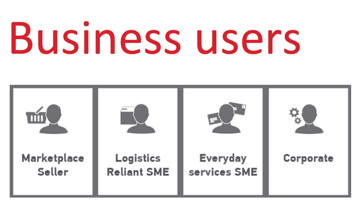
Our strategy team had created personas panning personal to business customers.
I created an inventory of 60+ user journeys we had to redesign in a user-centric way with user testing integrated in our ways of working, and documenting a design system as we went along.
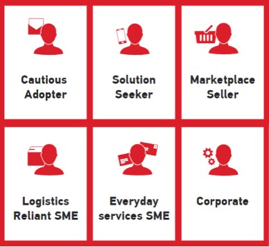
6 personas
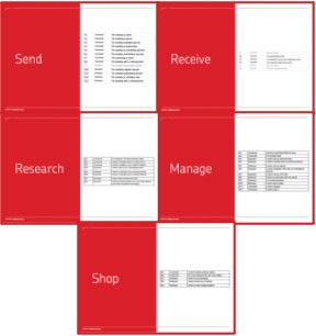
60+ user journeys
Rapid prototyping
Atomic design system
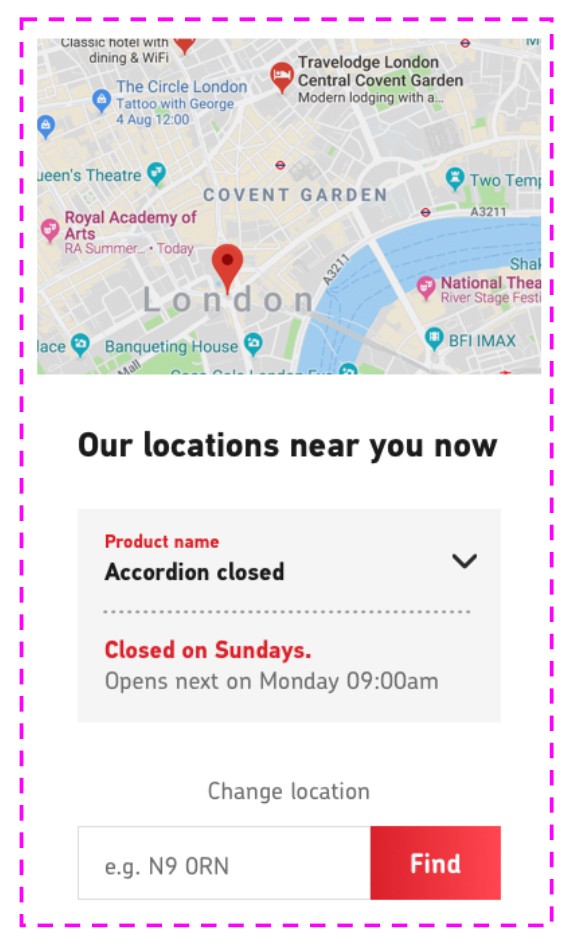
We built the UX and design from the ground up, using an atomic approach. Each component would be an organism, made of molecules, each in turn made of atoms, the smallest element of UI in the design system. The principle is that each atom updated would trickle to the entire site. It would be easier to maintain and ensure consistency.
Atoms
Molecules
Organisms
Mobile first user journeys
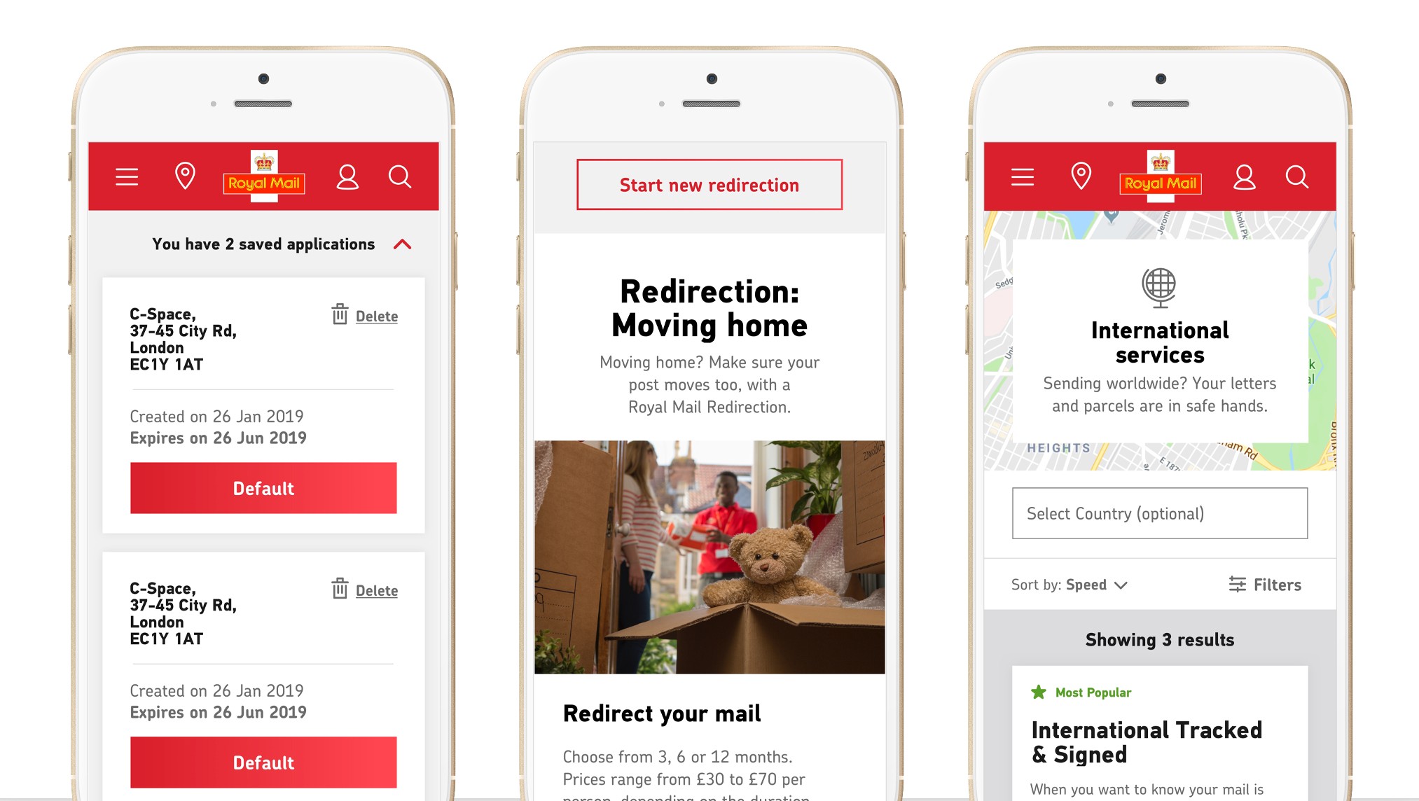
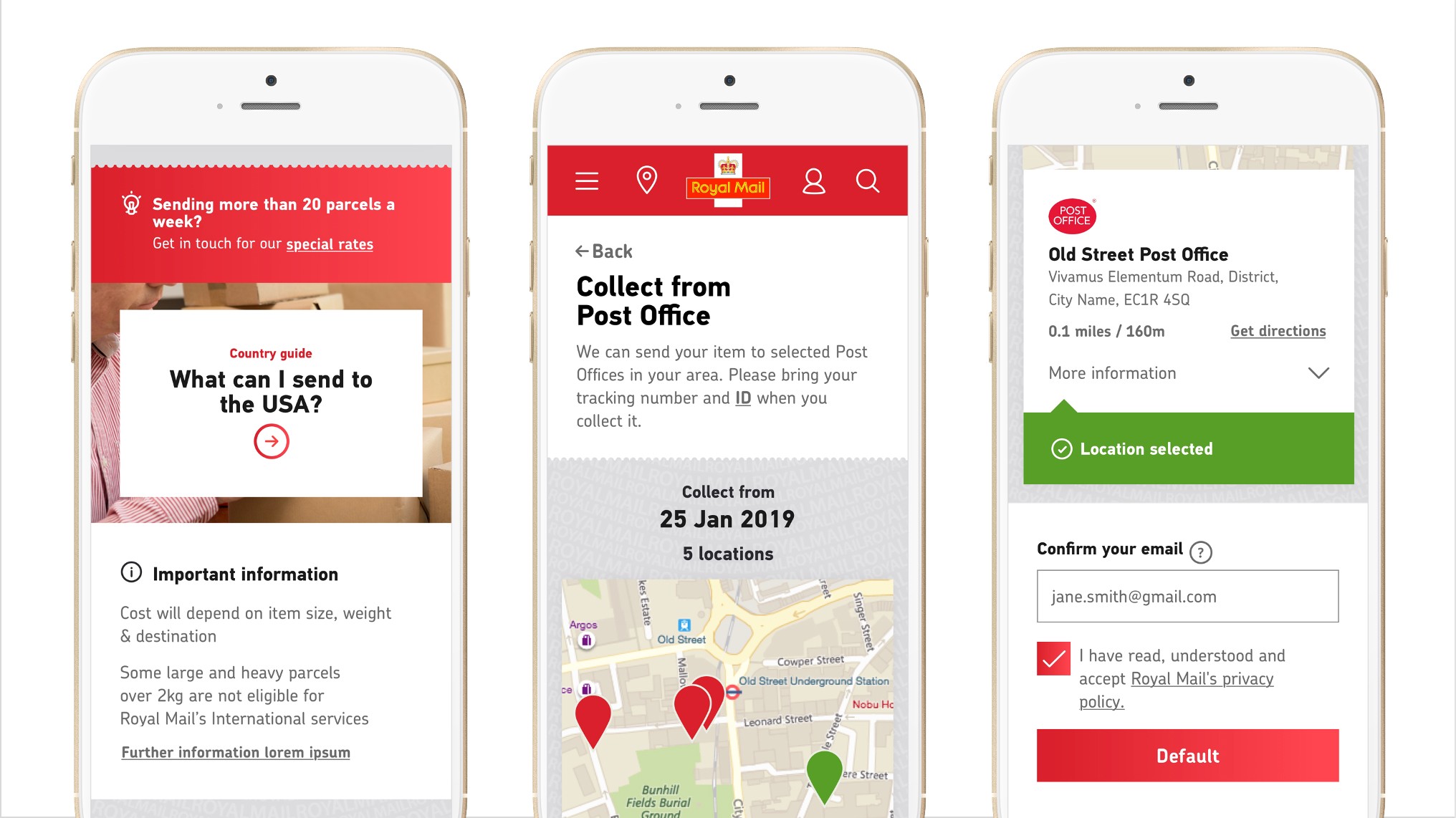
The output of this process was a modular system that defined components and interactions across the website. Working in this way ensured a consistency within the experience, while being flexible enough to create new templates and pages.
I crafted each journey meticulously, using user research along the way to refine interactions and simplify and optimise journeys.
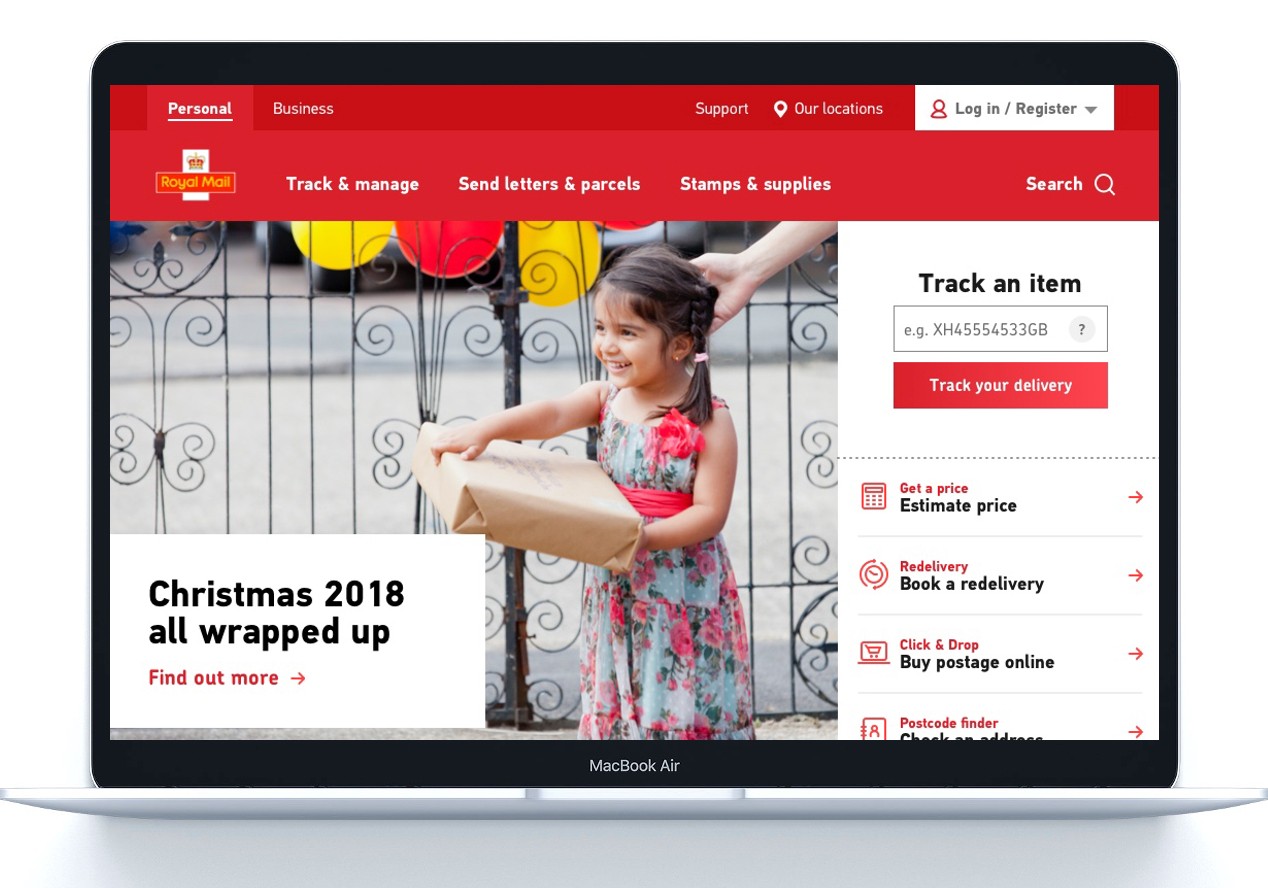
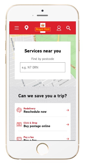
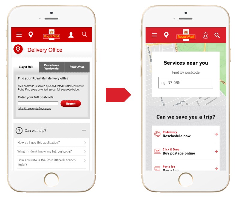
Old vs New
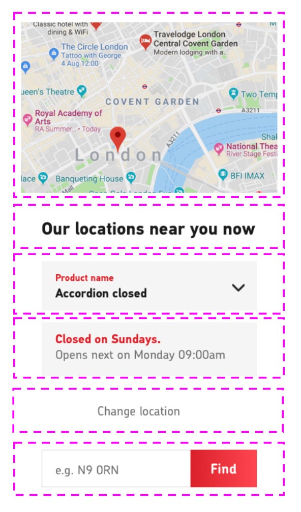
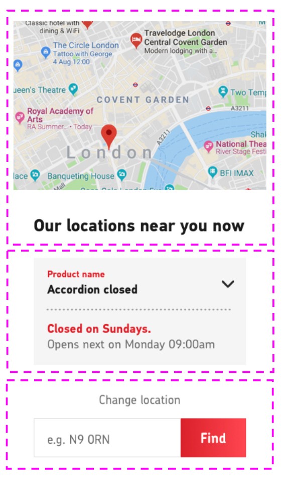
Design system in action
Design
To redesign each journey, I had to focus on user needs but also take into account what Royal Mail could not or not do technically as the project had a rapid turn-around.
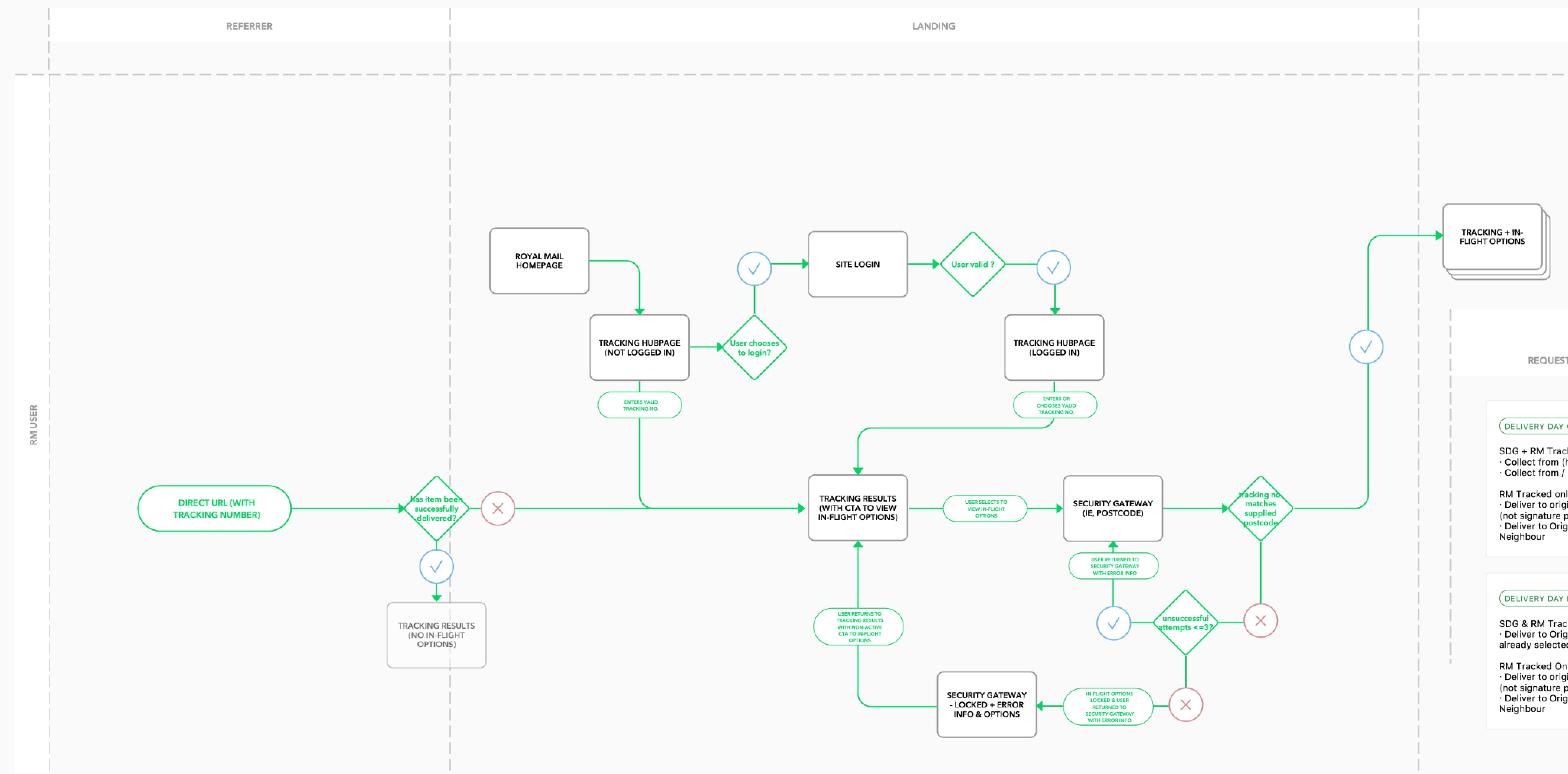
Understanding the back-end process
To rebuild new journeys, I had to start from the business data flows we could not change.
Redelivery process flow I documented
User-centred solution
Using our persona insights and user journey analysis, I would then be able to create rapid user-centred UX prototypes, including UX copy, ready for user testing. I would absorb current best practice and design ideation to create initial prototypes, whilst reusing any already documented design system elements or adding wireframe specifications for new ones.
Rapid prototype
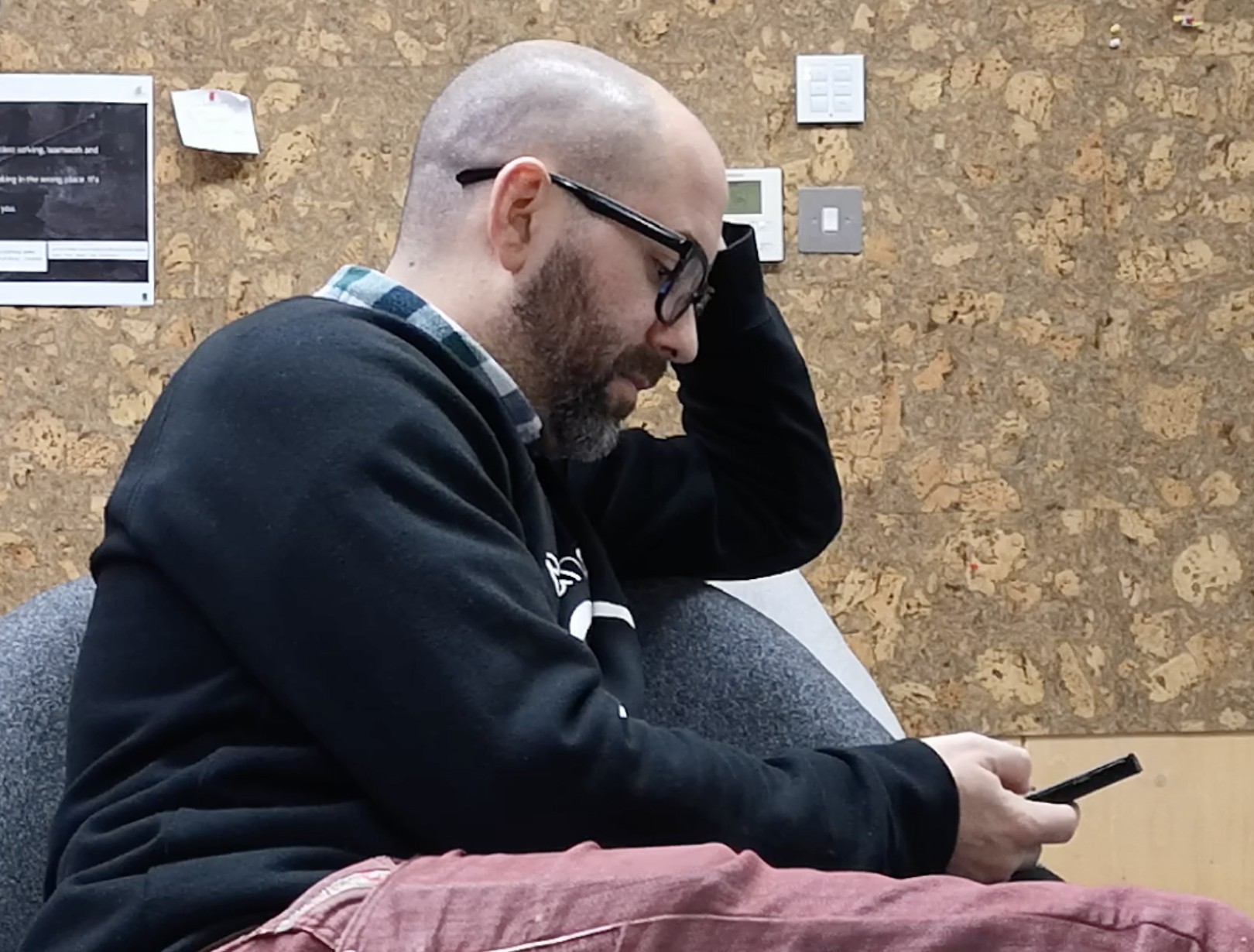
Guerilla user testing and iterative design
I would then run guerilla user testing to get initial feedback and refine the prototype before presenting the proposed solution at the next demo.
Guerilla testing - mobile first
Comprehensive UX deliverables
I would deliver the UX to Royal Mail's tech partner for them to build the service, including all edge cases and break points, whilst design created the UI version and updated the design system as required.
UX deliverable for a journey, mobile version
Example journey:
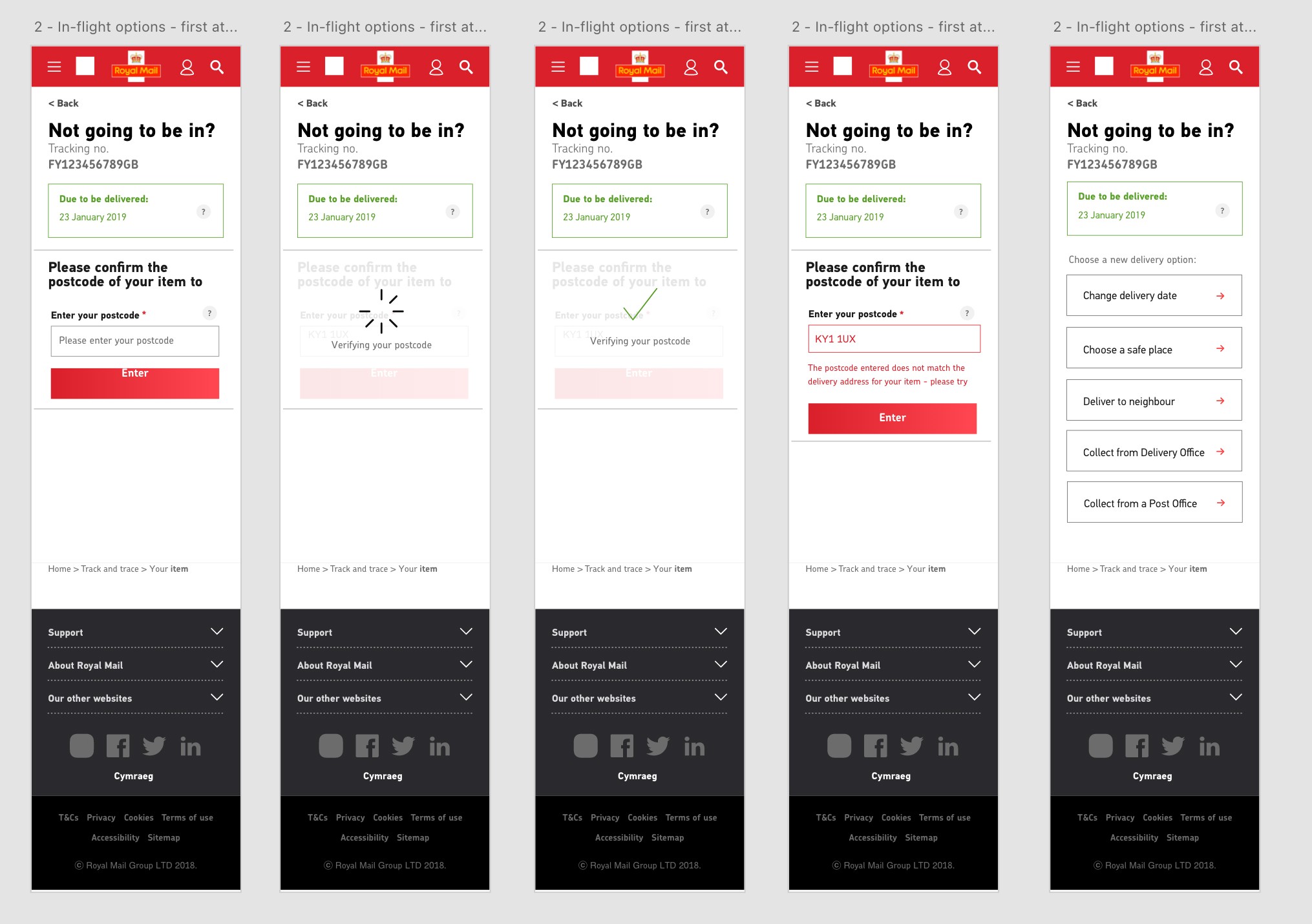
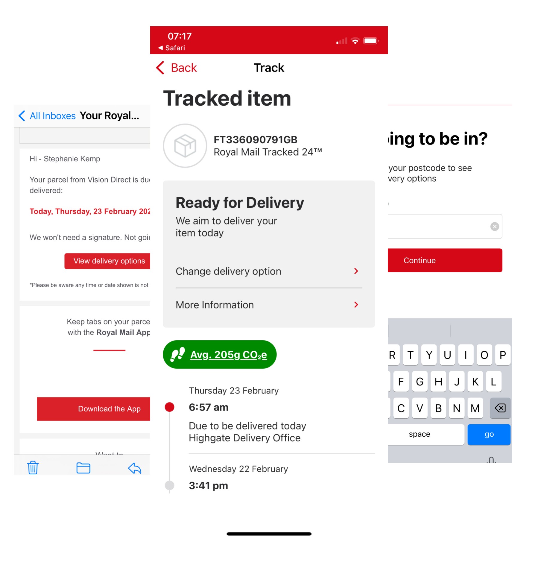
In-Flight Track & Trace
Here is an example of a typical piece of work I had to deliver in a sprint: redesign the Track and trace user journey.
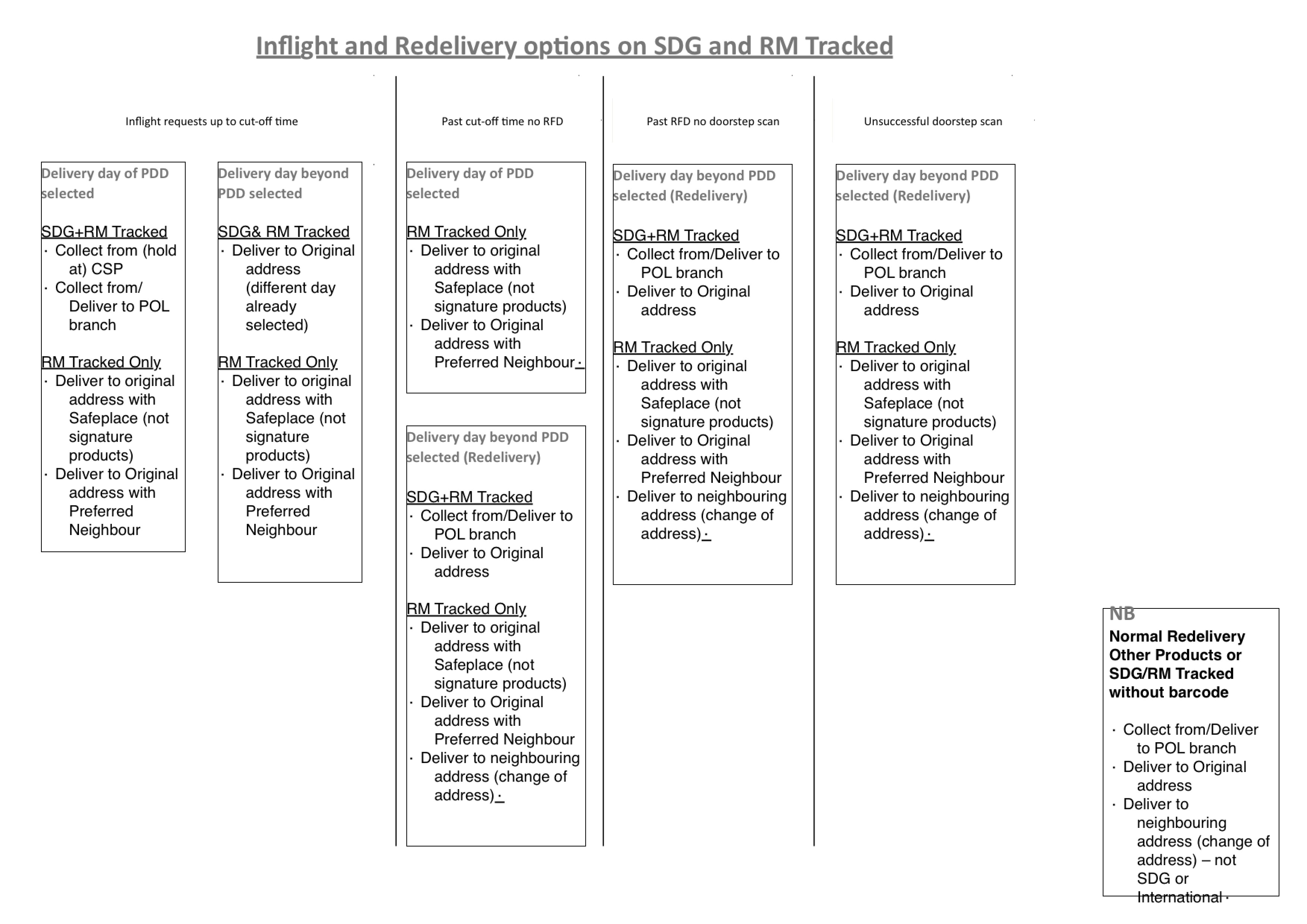
First I had to understand the existing Royal Mail process to make sure my solution met the business technical constraints.
I also had to modernise the UX to meet user's expectations, and better the competition, really empathising with the end user and addressing all possible scenarios.
Starting point: Business Rules & Existing Process
Result: Interface to meet contemporary customer expectations
Purposeful business navigation
One of the biggest challenge was the redesign of the business section of the site, as it was unloved and was product rather than user centric.
With input from user research and data analytics, I created a simpler purposeful navigation for our business users.
Approach
As UX lead on the project, my goal was to deliver a purposeful user-centred navigation.
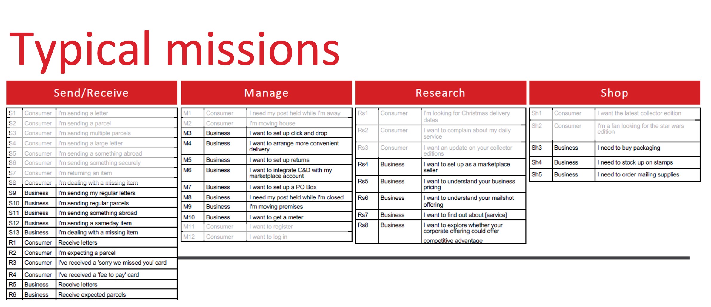
I started from insights from our audience and business stakeholders via interviews. My strategy colleague analysed most popular mission journeys and popular destination pages. Together, we came up with different possible hypothesis for the IA at a high level.
Personas
Missions
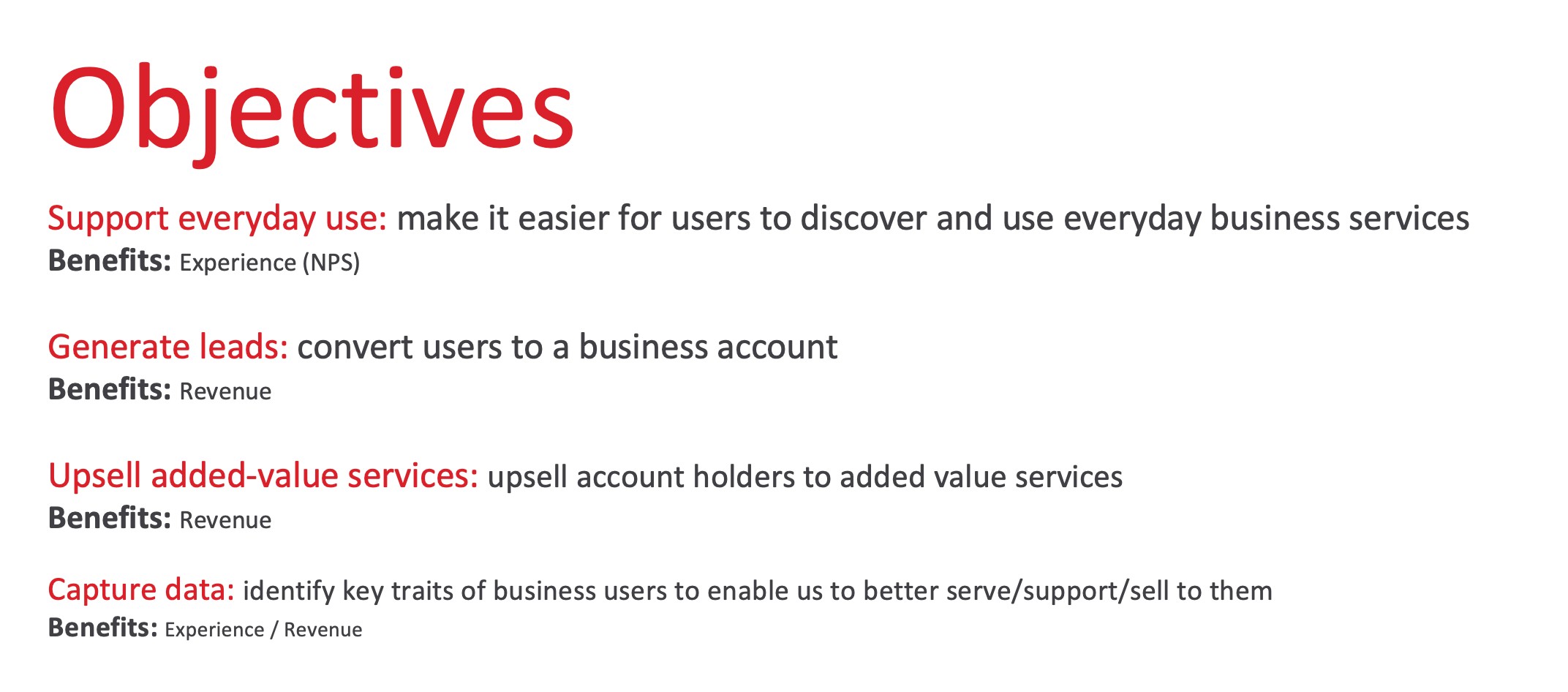
User and business objectives
Navigation hypothesis
We started by ideating possible navigation systems, groupings, labelling and UX designs.
We used a combination of client workshops, card sorting exercises, existing bottom up site map analysis, user discovery and validation interviews as well as deep data analytics to come up with our initial hypotheses.
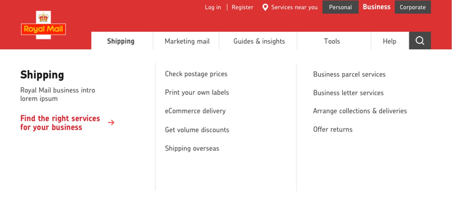
Example of purposeful business navigation: "help me scale up'
Testing the new IA
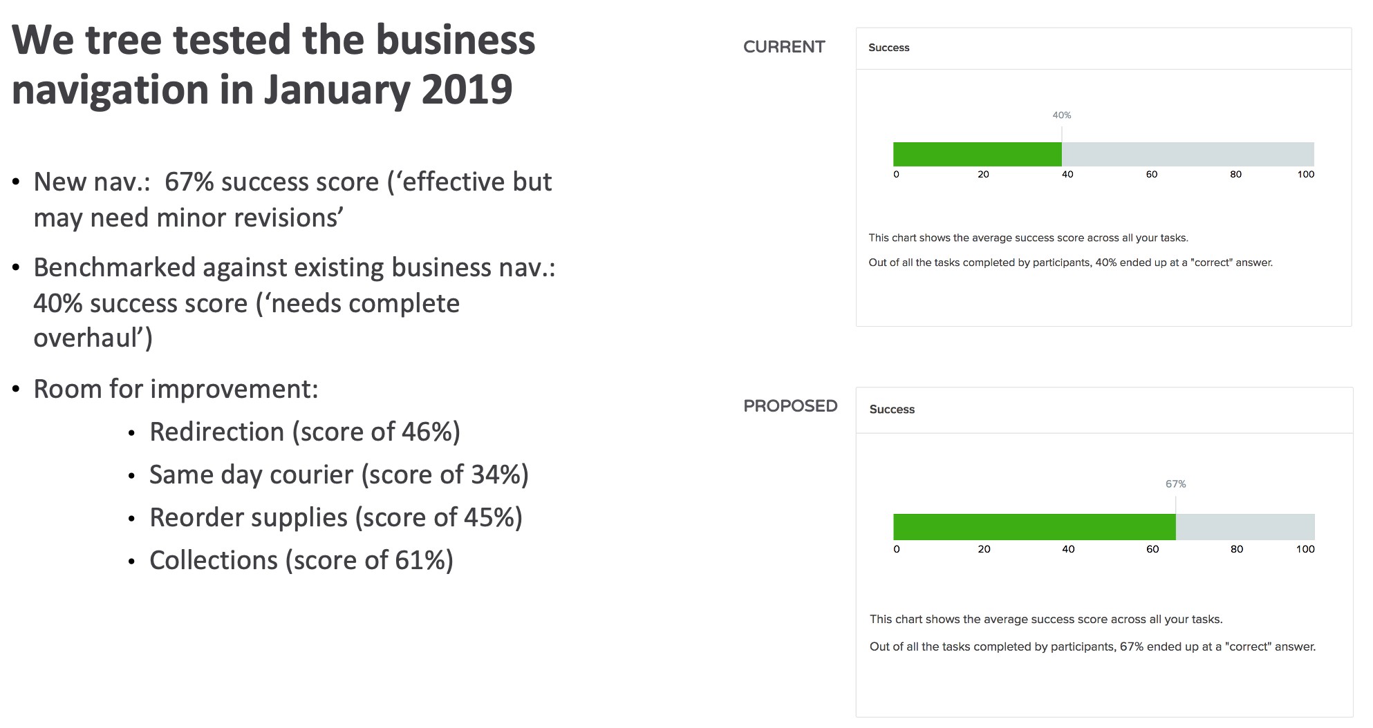
I used OptimalWorkshop to test our different hypotheses and compare them against the existing navigation as a benchmark.
I set up the tests to cover priority journeys for our personas.
Extract from the test debrief
End solution
I delivered the new navigation, including its phased versions, to deliver better findability and conversion on key missions, as well as better discovery of added-value services.
Extract from the an interim Royal Mail business navigation
Conclusion
The Royal Mail Redesign was an incredible project, spanning over 23 sprints. We were co-located at Royal Mail's head office to ensure access to stakeholders and collaboration with the PO and head of digital.
We created a modern digital presence for the institution and set them up for their growing digital capability, still in place today.
