Recent work
Art Fund Redesign
User-centred redesign of an entire ecosystem
Art Fund is a UK charity that provides grants, crowdfunding or ticket selling services to 700+ museums, galleries and historic places around the UK. It is funded by its members through the sale of the National Art Pass or donations. In return, members get free or discounted entry to venues and exhibitions.
I led the UX to deliver a complete overhaul of the site in 10 agile sprints.
UX
AGILE
UCD
USER TESTING
IA
ECOMMERCE
B2C, B2B
DESIGN SYSTEM
ROLE
UX Lead
TEAM
Emily Regan, designer
Elly Belden, Senior designer
David Underwood, Project manager
CLIENT
Art Fund
Lauren Bailey, PO
DURATION
7 months
The challenge
The Art Fund website was dated and confusing. It failed to meet the diverse needs of cultural seekers, art advocates and museum professionals, our key personas, assuming they all shared the same interests.
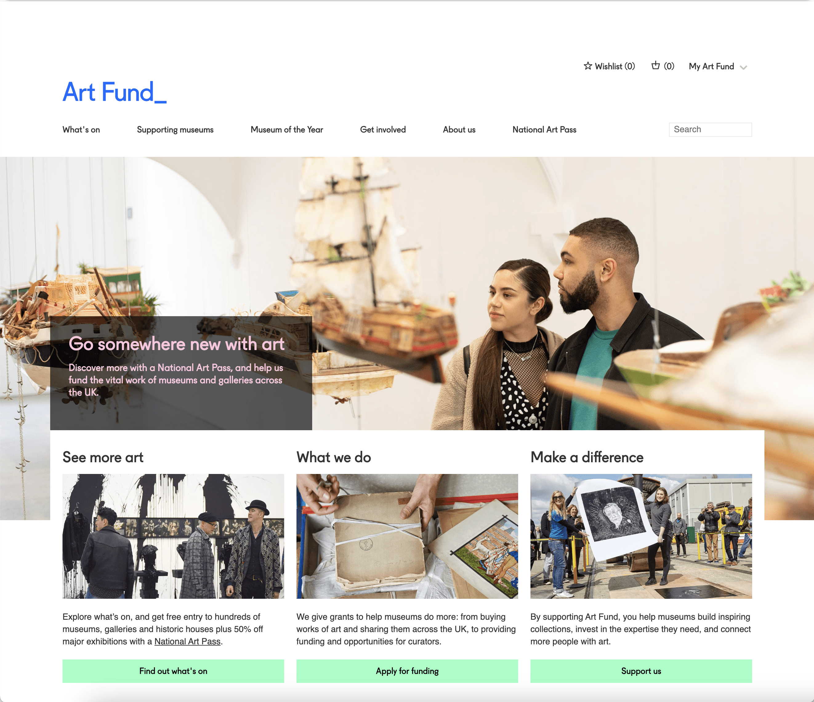
The site looked tired and made it difficult for users to find their ways around, let alone feel inspired to join or explore. It didn’t tell the story of what Art Fund was. Key journeys were under-performing: exploring, joining, donating.
Museum professionals experienced the same issues, not able to find out how to get the most out of the charity.
Setting up the project right
The requirements were complex, with a client that was used to deep thinking. We first had to make sure we were designing the right product, with a well defined scope, vision and approach.
Discovery: user insights
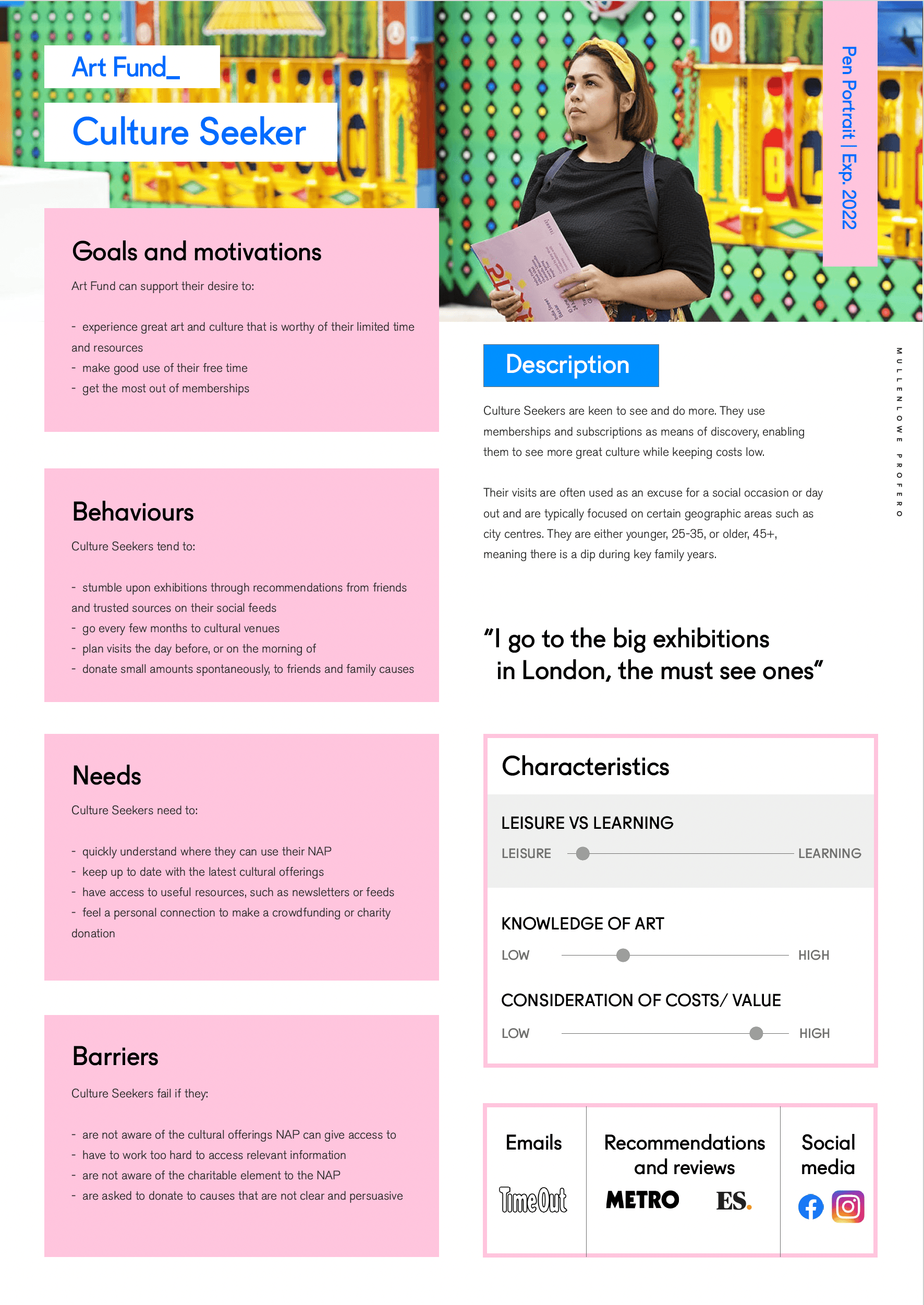
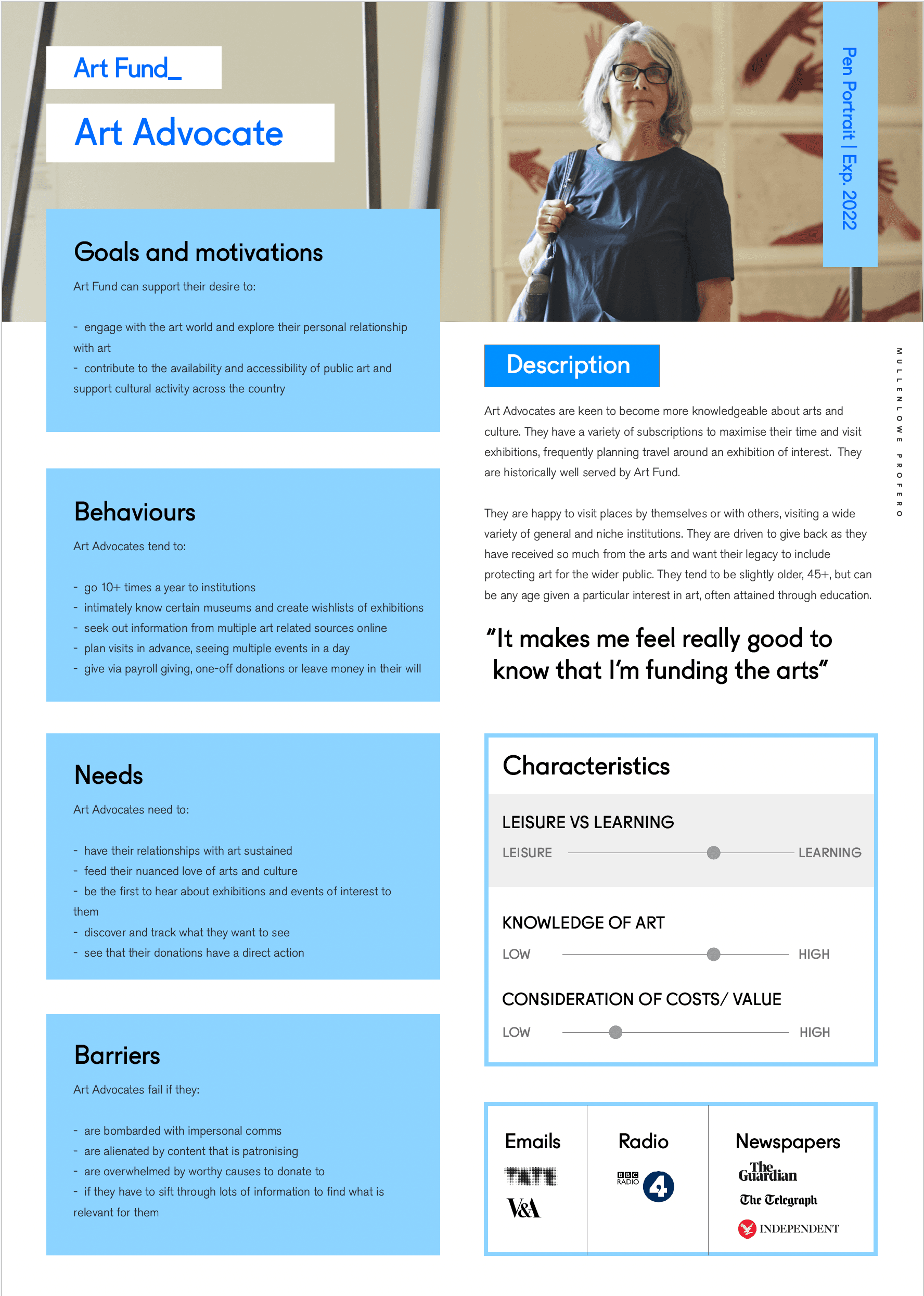
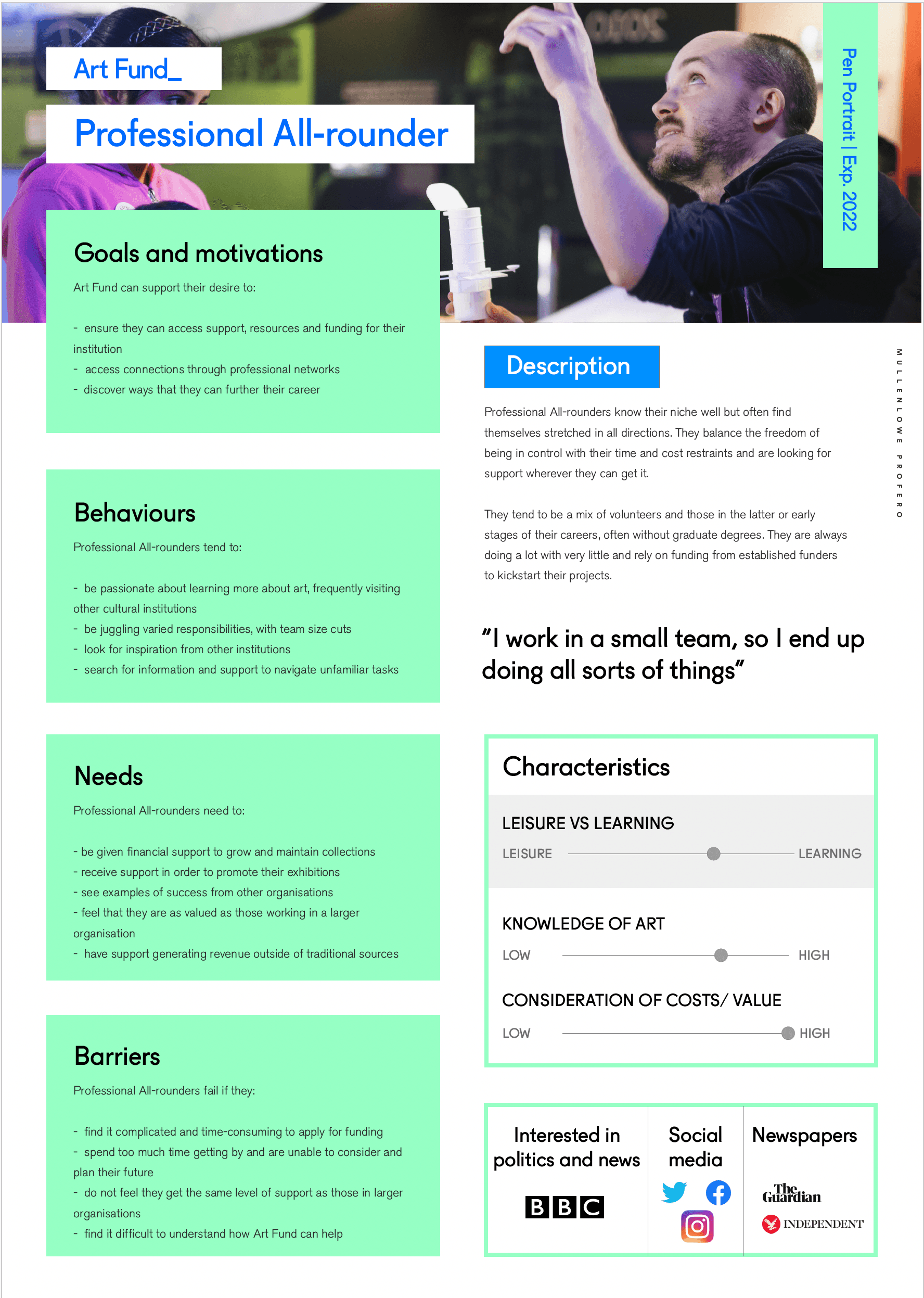
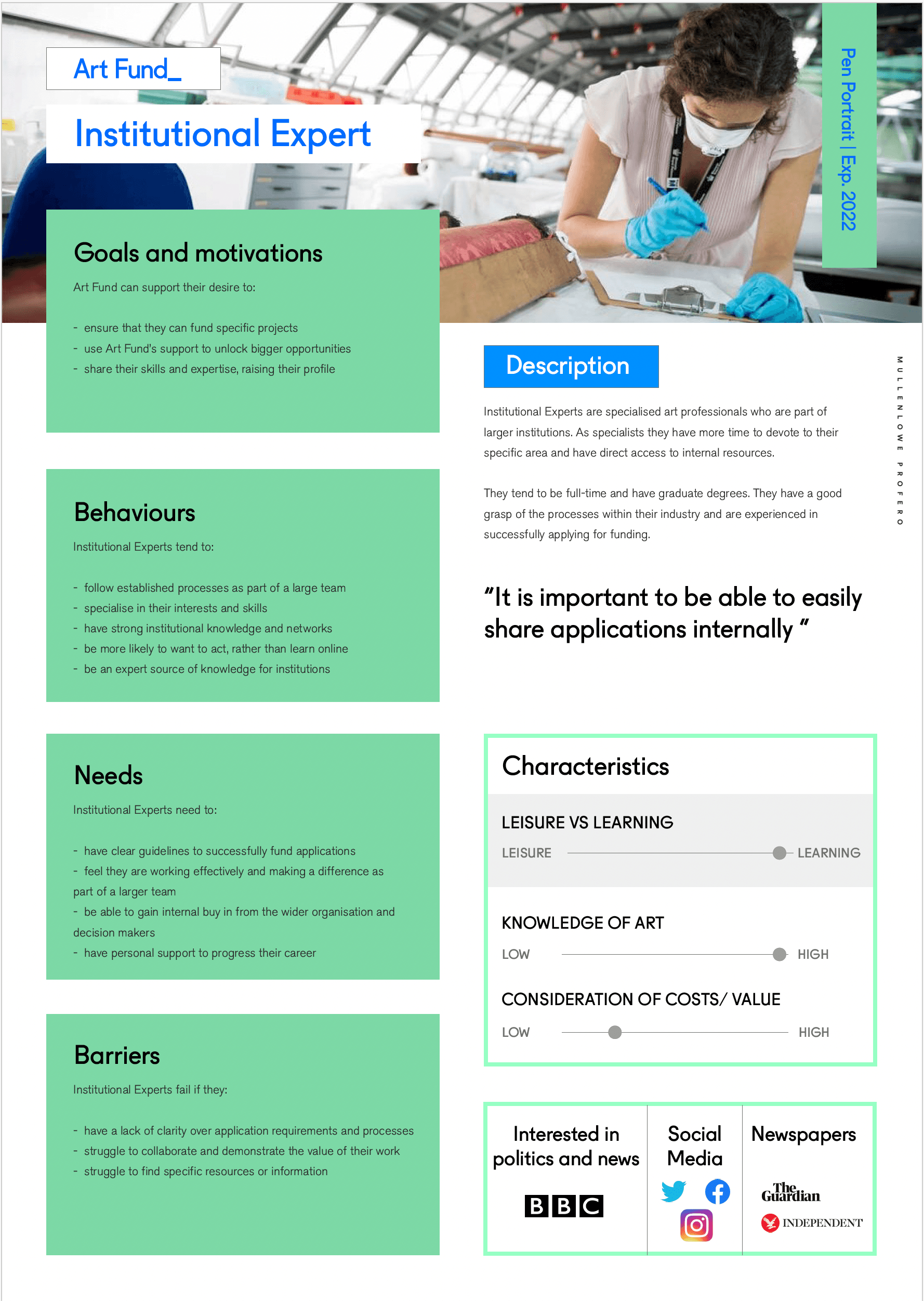
As our starting point, we had pen portraits and an initial golden path prototype which I tested with end users.
I documented and collated the insights from the user testing I conducted.
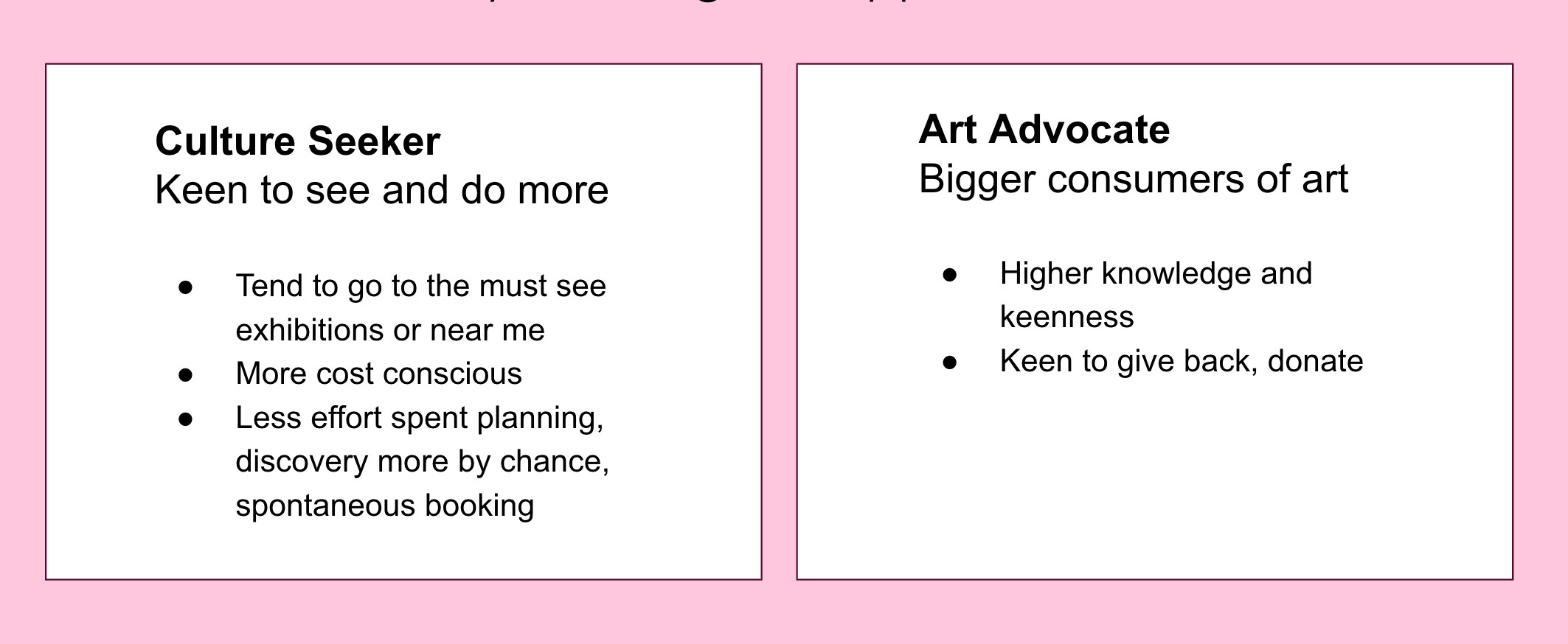
Primary consumer persona
Secondary consumer persona
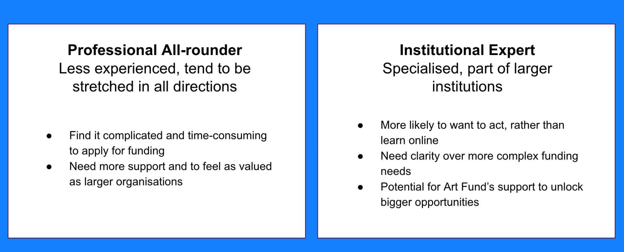
Primary professional persona
Secondary professional persona
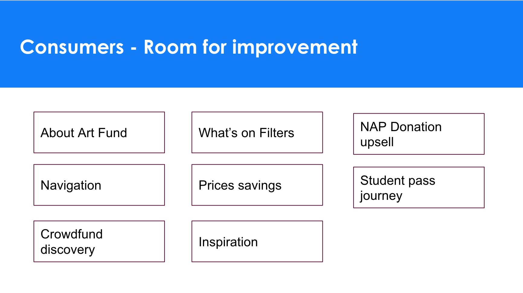
Consumers insights summary
Professionals insights summary
Key pain points discovered from user research
Strategic business challenge example
The vision: Defining UX principles for the site
UX principles had to be unique to Art Fund and differentiate the experience in a way that was aligned to the brand and the site's experience goals. Based on user and competitors research, I defined the following 4 UX principles to be our guide for the project.
UX principles
The requirements: Defining the product roadmap
I facilitated workshops to define the scope, grouping user stories, and getting agreement on priorities and roadmap for the project.
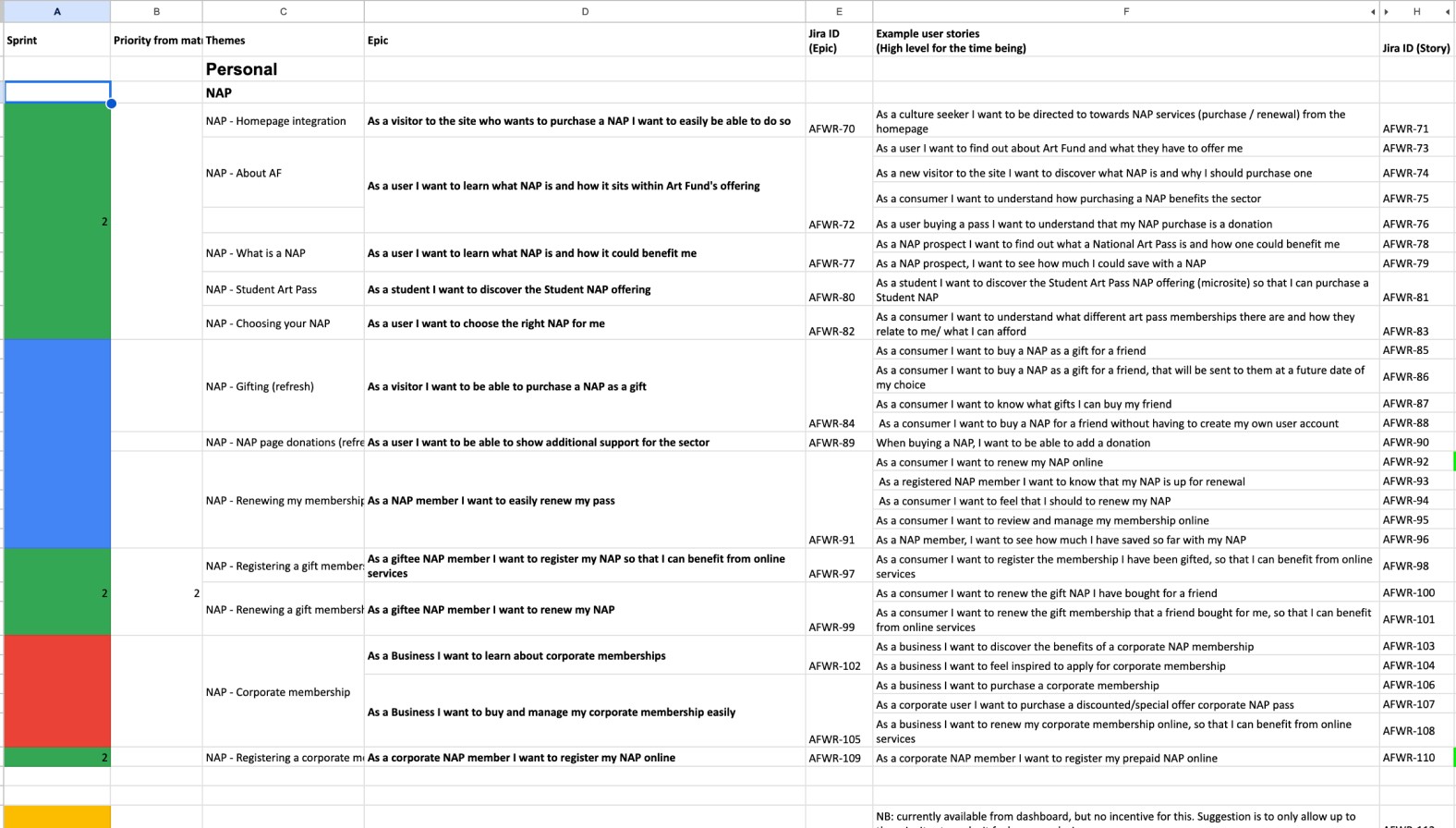
478 user stories !
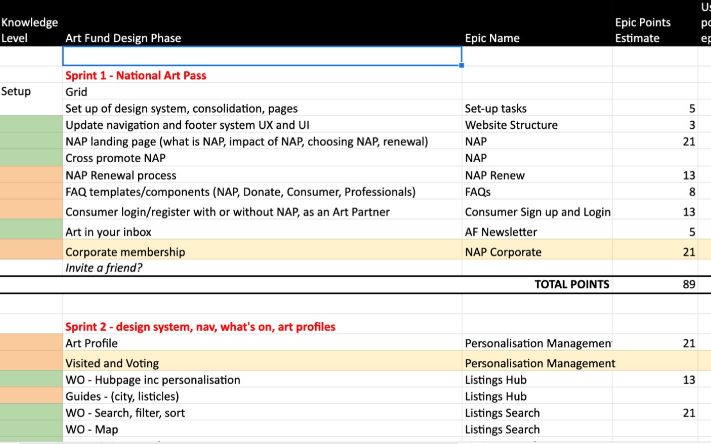
Roadmap sprint by sprint
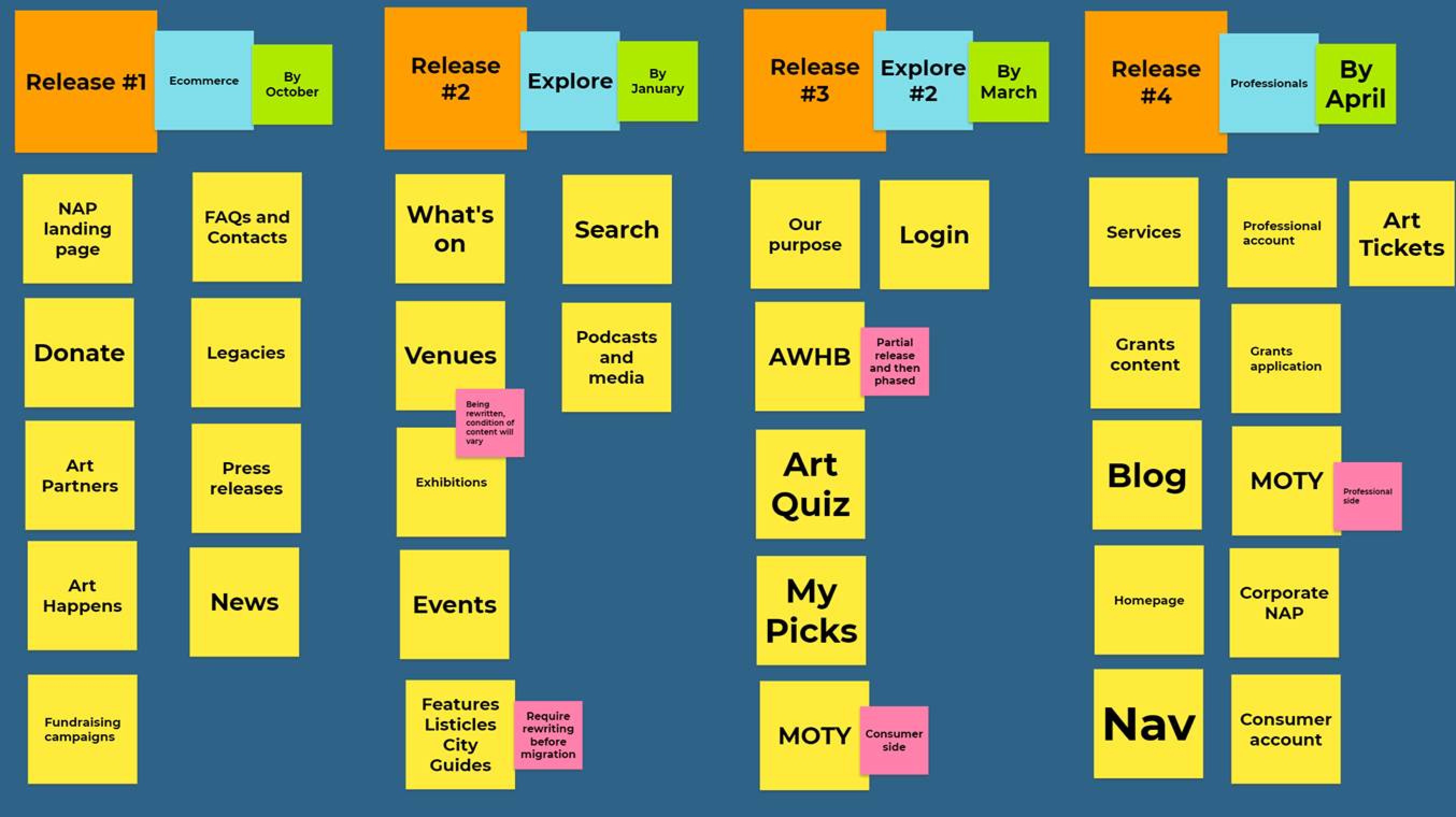
Release plan
Ways of working: Adapting agile to make it work for us
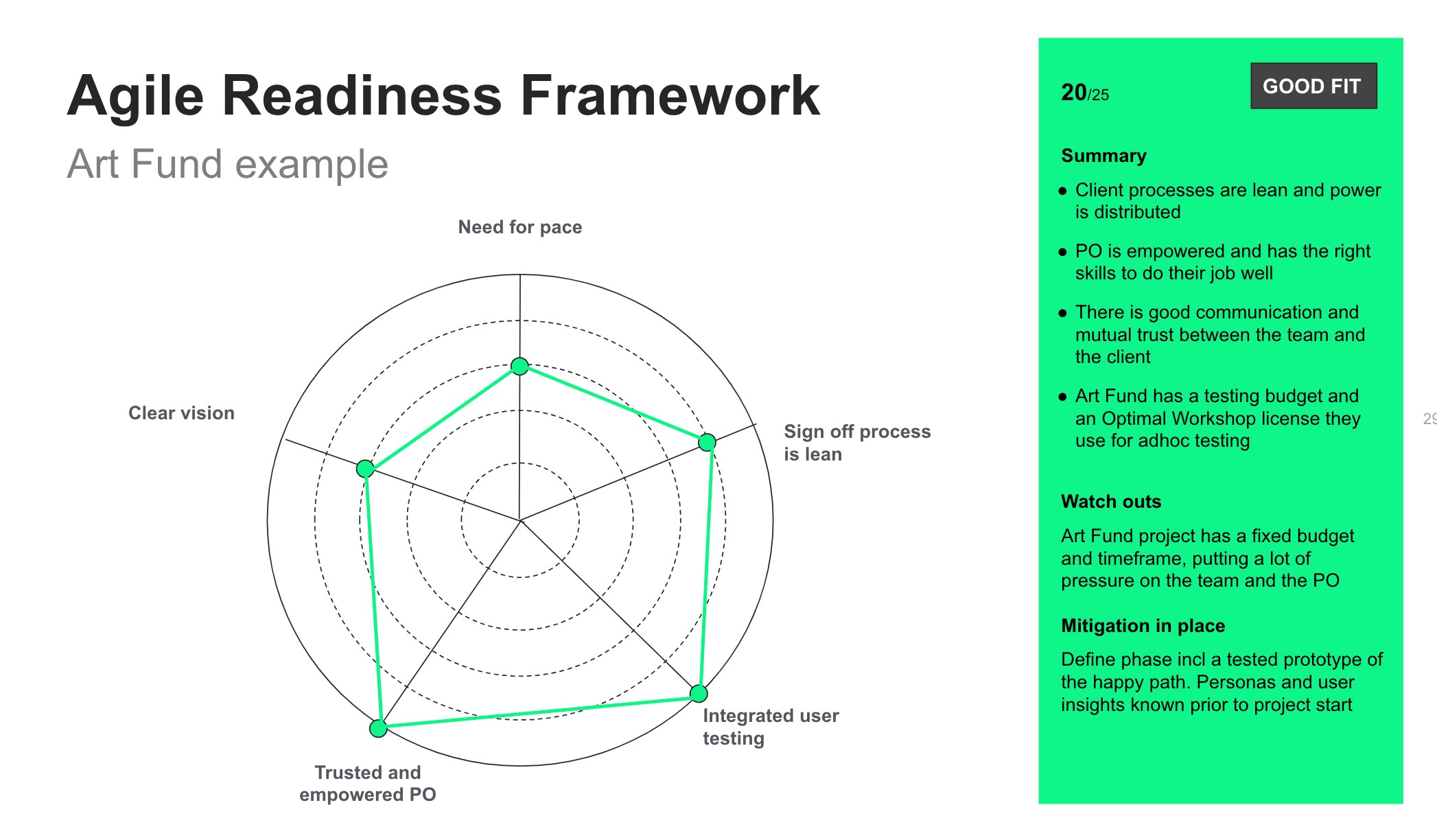
The client was new to agile. We had to train them and also adapt the methodology to make it work for them.
On top of classic agile methodologies, I worked hard to create a close relationship with the PO, putting in place a routine and techniques to solve problems fast and achieve extremely high velocity throughout the project.
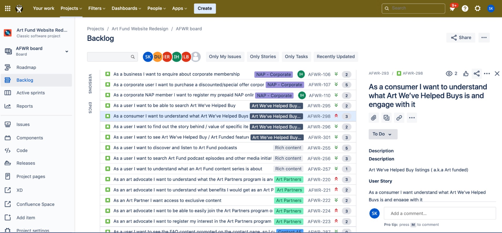
Jira backlog was supplemented by a task list for the sprint I put together for the team
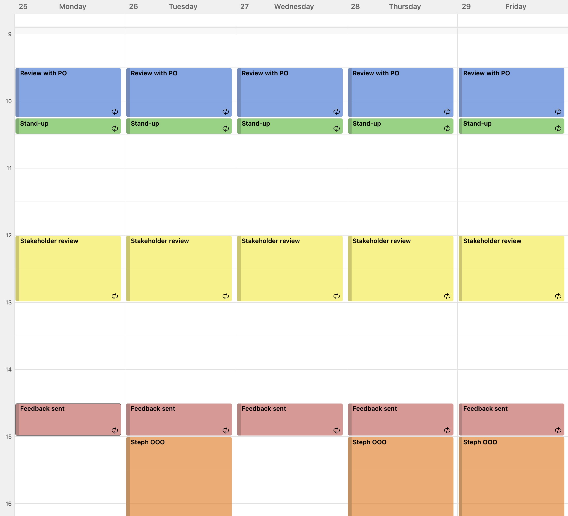
Daily routine I put in place
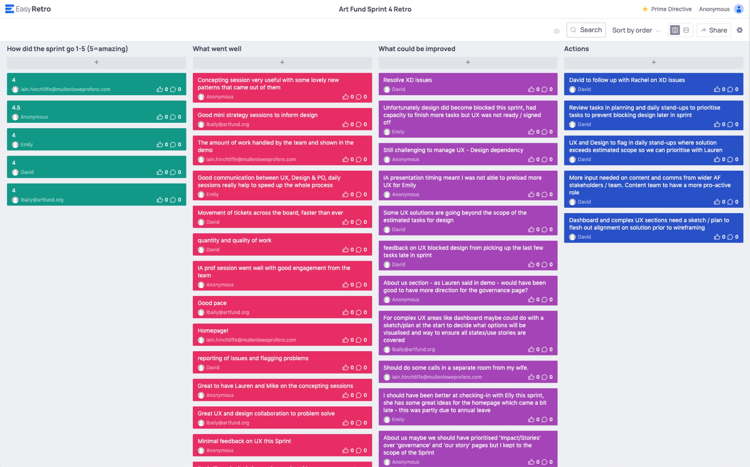
Retros to continuously improve the process. We achieved average of 4.5/5 rating per sprint
UX design: solutions to key pain points
The scope was huge and to deliver our scope we had to achieve a consistently high velocity. This allowed me to experiment with new lean design techniques to get to the best solution fast and then iterate through user testing.
Here are some examples of the UX deliverables for key challenges we faced during the project.
Understand Art Fund's value proposition at a glance
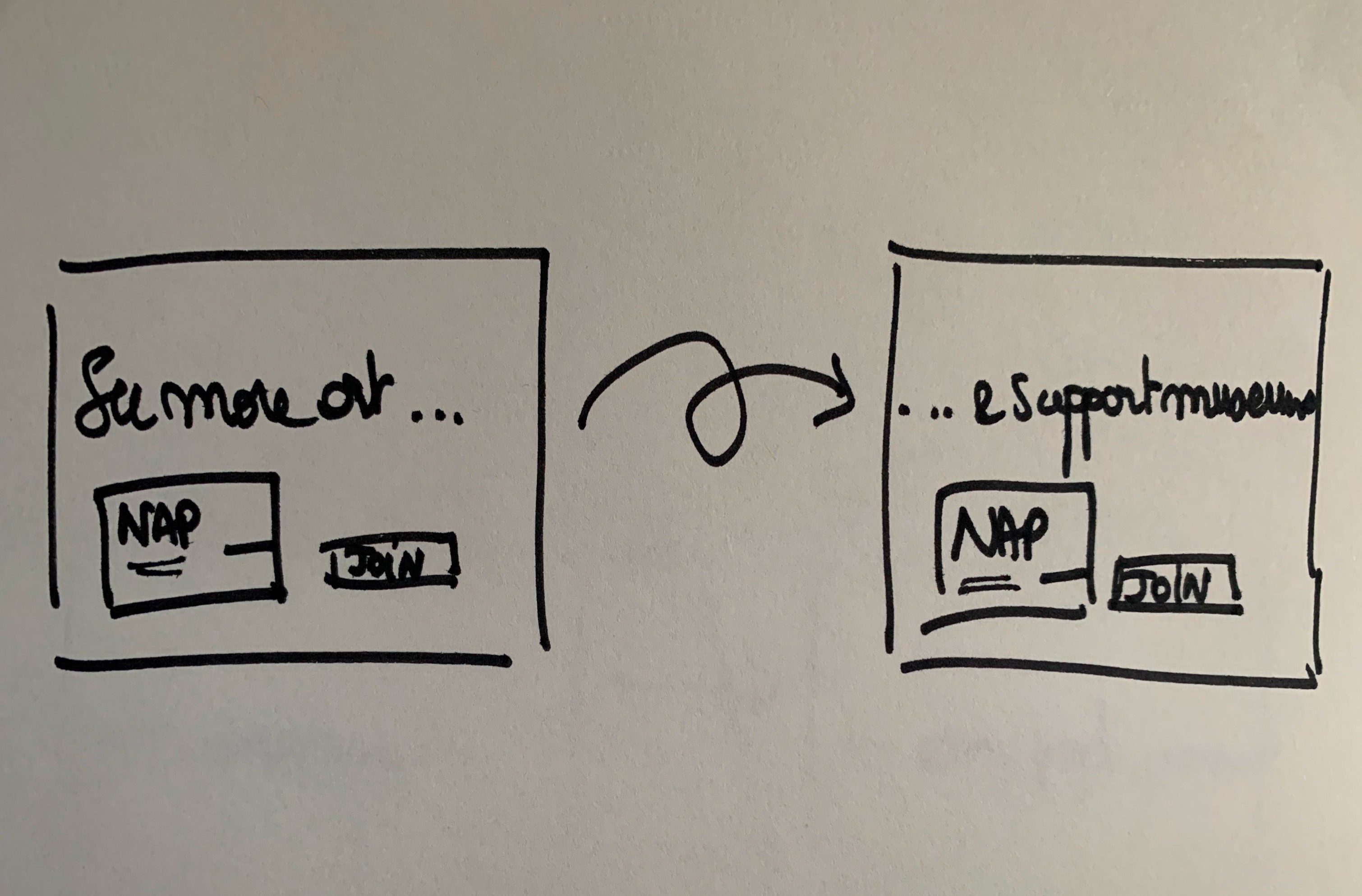
Challenge: an Art Pass membership is also a donation to all UK museums. Art Fund's proposition was really recessive on their old site. I needed to raise the profile of Art Fund's unique model by clearly communicating it within the site, on the homepage and also where it mattered. This is an example of how we achieved this on the homepage.
Method: I organised and facilitated rapid concept sessions:
Write the brief, what is the problem we need to solve?
Prepare inspiration
Concept ideas
Discuss and vote on the one to push forward
Result: Once I had identified the problem to solve, we were able to generate many ideas as a team and move on quickly. My concept below was the one we selected.
Early UX concept for the homepage

Interim animation by Emily Regan
Improve National Art Pass conversion
Challenge: Increase sales of the pass. Show the value of the National Art Pass, where you can go, how the money is used. Complete your purchase easily and beautifully.
Method: Rapid prototyping, usability testing, address multitude of edge cases and bus requirements… I analysed the product in detail to make sure I understood it inside out, then looked at best practice inspiration. I created wireframes that met our public personas needs, as well as the business scenarios we needed to cater for, in a way that would increase number of sales.
Result: Improved conversion rate, higher sales, happy client
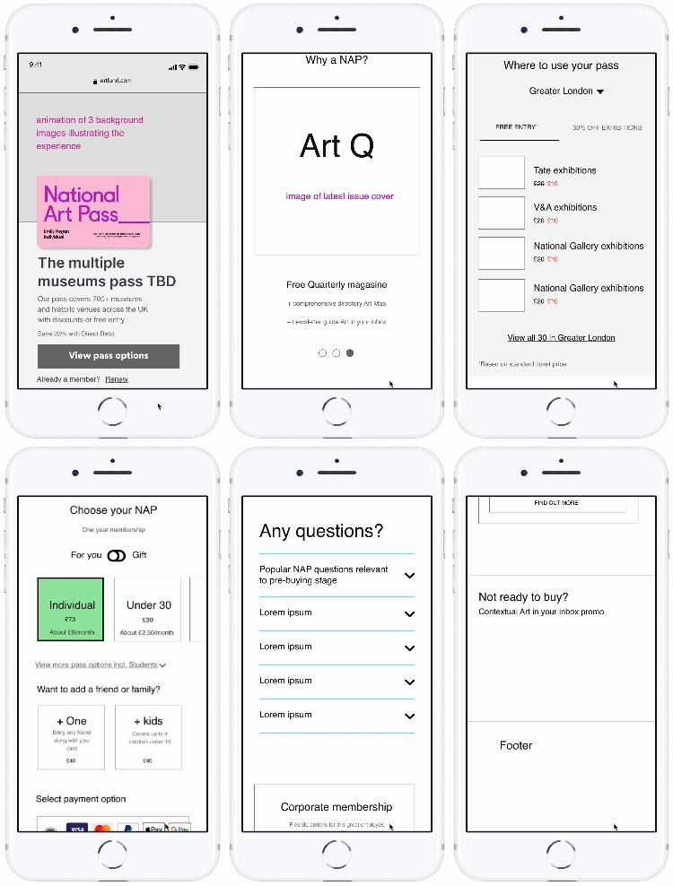
UX wireframe default state
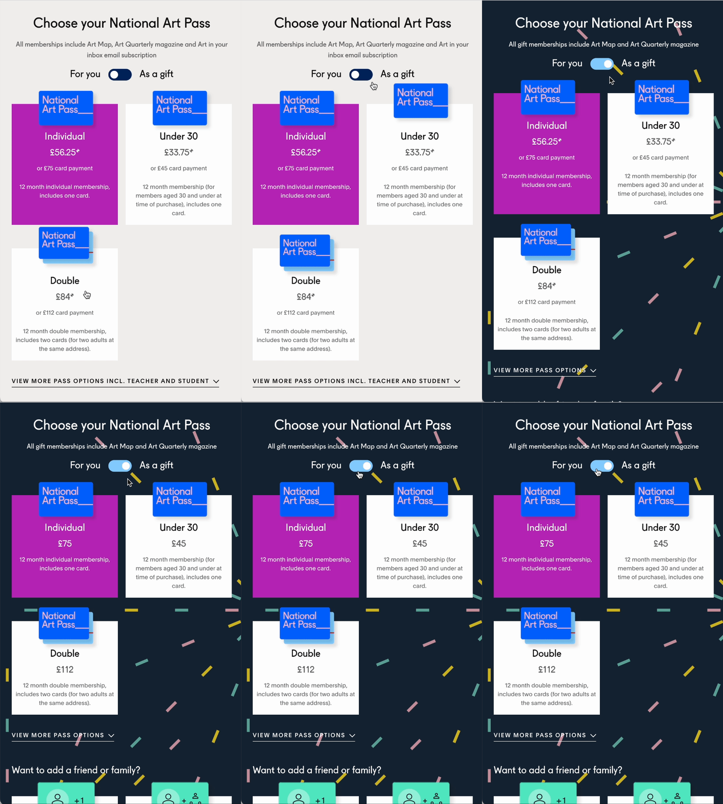
Make gifting a National Art Pass feel special
Challenge: Make gifting a NAP feel special and rewarding
Method: Added the playful toggle and confettis animation when gift mode is selected
Result: Surprise and delight. The toggle is a cute way to switch between buying for self or as a gift mode. The confetti animation adds that visual surprise and joyful element that are an integral part of a great gifting experience. This joyful experience is carried through the purchase journey.
Gifting mode, UX by me, design by Emily Regan
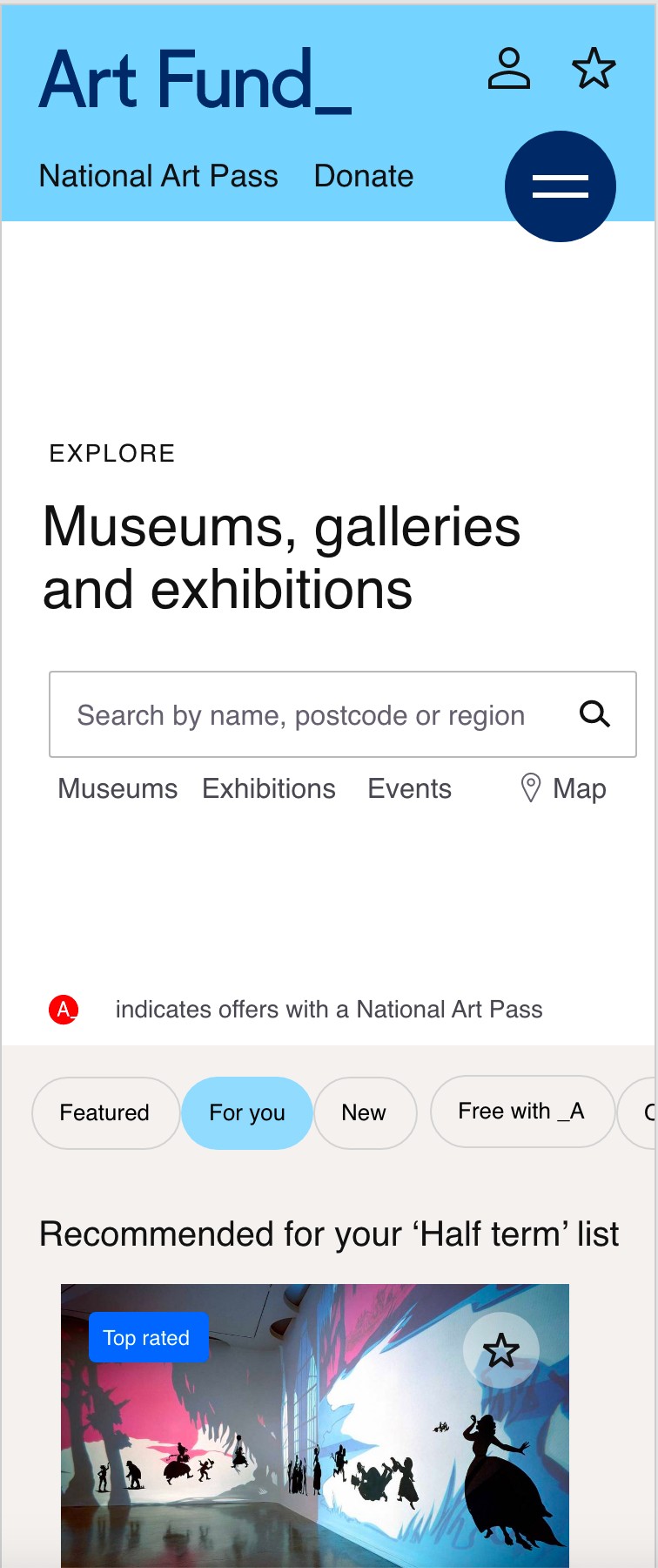
Inspire Cultural Seekers to explore
Problem to solve: Make exploring where to go with your National Art Pass inspiring and inviting, expanding art possibilities, in a way that matches your tastes, needs and location, is effortless and allows serendipity.
Method: This took a lot of UX thinking, analysing user insights, card sorting, wireframing, iterating. I created a rich search and browse experience, and a tagging system to power it all. I also created personalisation rules to create serendipity moments when exploring venues and exhibitions as a logged in or not logged in user.
Result: Simple design yet infinite exploring possibilities, whilst generating data creation for personalisation. I also created the set of rules for personalisation.
UX wireframe - Explore page, personalised example
Discover donation opportunities to causes close to my heart
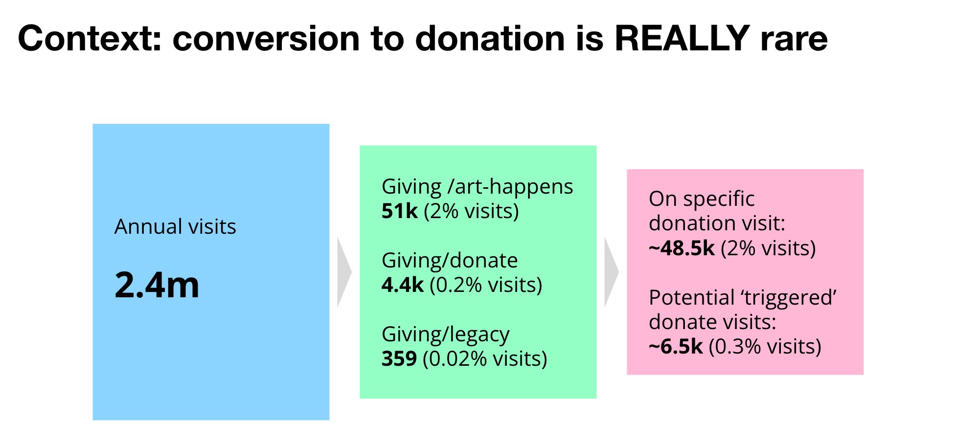
Challenge: Donations through the site were extremely low and yet are an important key source of revenue for Art Fund, a charity for all UK museums and charities.
Method: Through research, I found out that people were more likely to donate to museums or galleries close to them, they were kikely to love and visit often. They were also more likely to donate to causes close to their heart, to art they loved. I therefore created a system where when searching for venues or exhibitions, this would return any matching crowdfunding project local or matching their taste as part of their results.
Result: The enhanced donation discovery feature increased click throughs and donations. I do not have the exact figures, but have been told by the client that conversion to donations has increased dramatically.
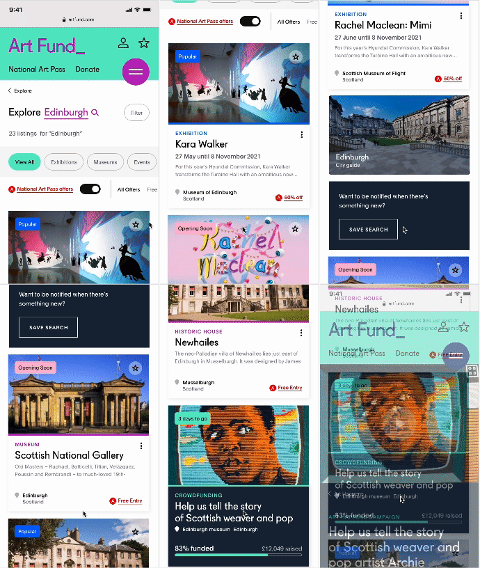
Explore contextual donation opportunities
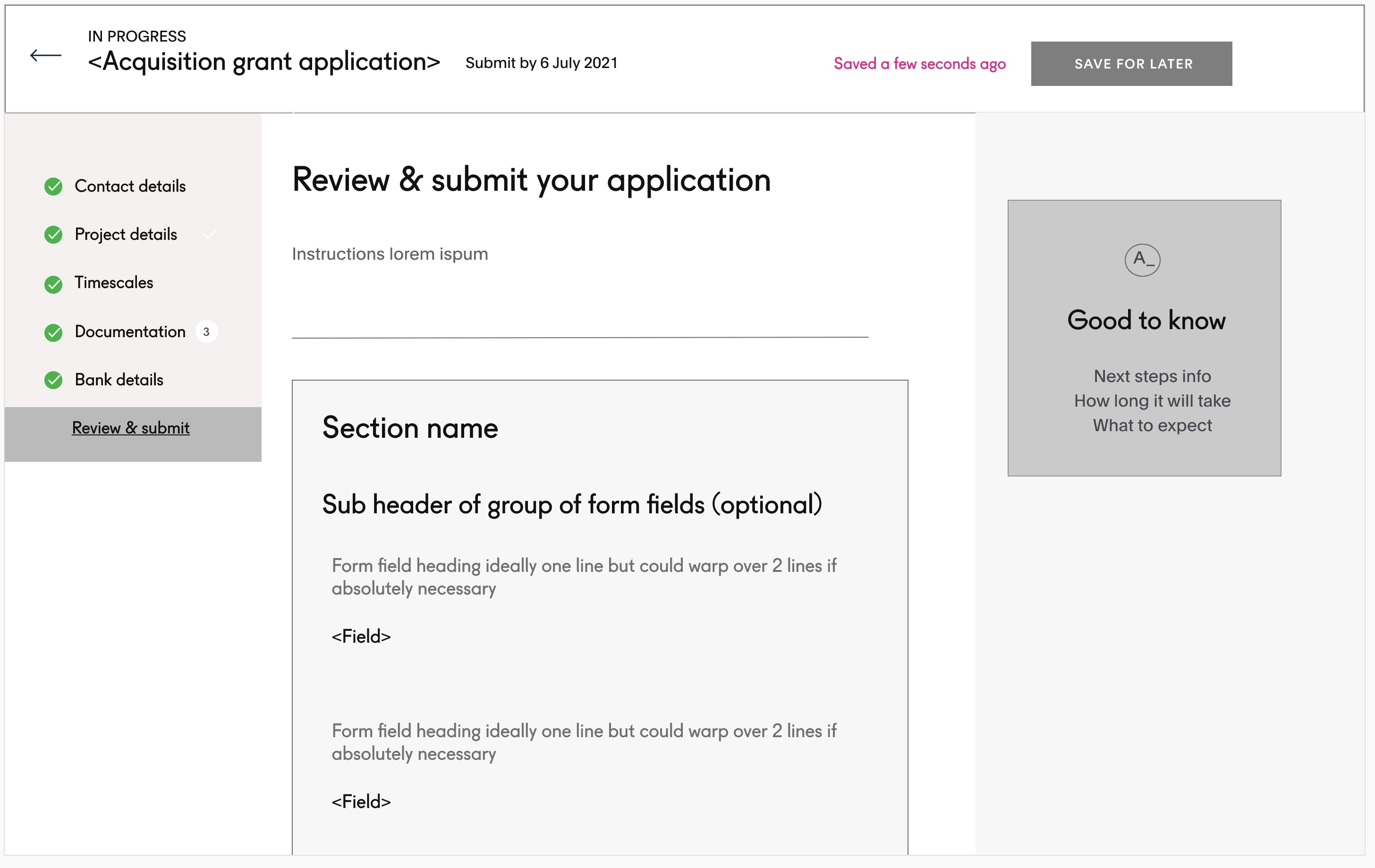
Simplify the grant application process for museum professionals
Challenge: Make applying for a grant a collaborative, stop and take-up again form process, intuitive and rewarding
Method: I had to first understand the business process, document the flow, then design an application process that was simple, intuitive and flexible to cater for all possible grants.
Result: Simple, visual, guided process made beautiful in design
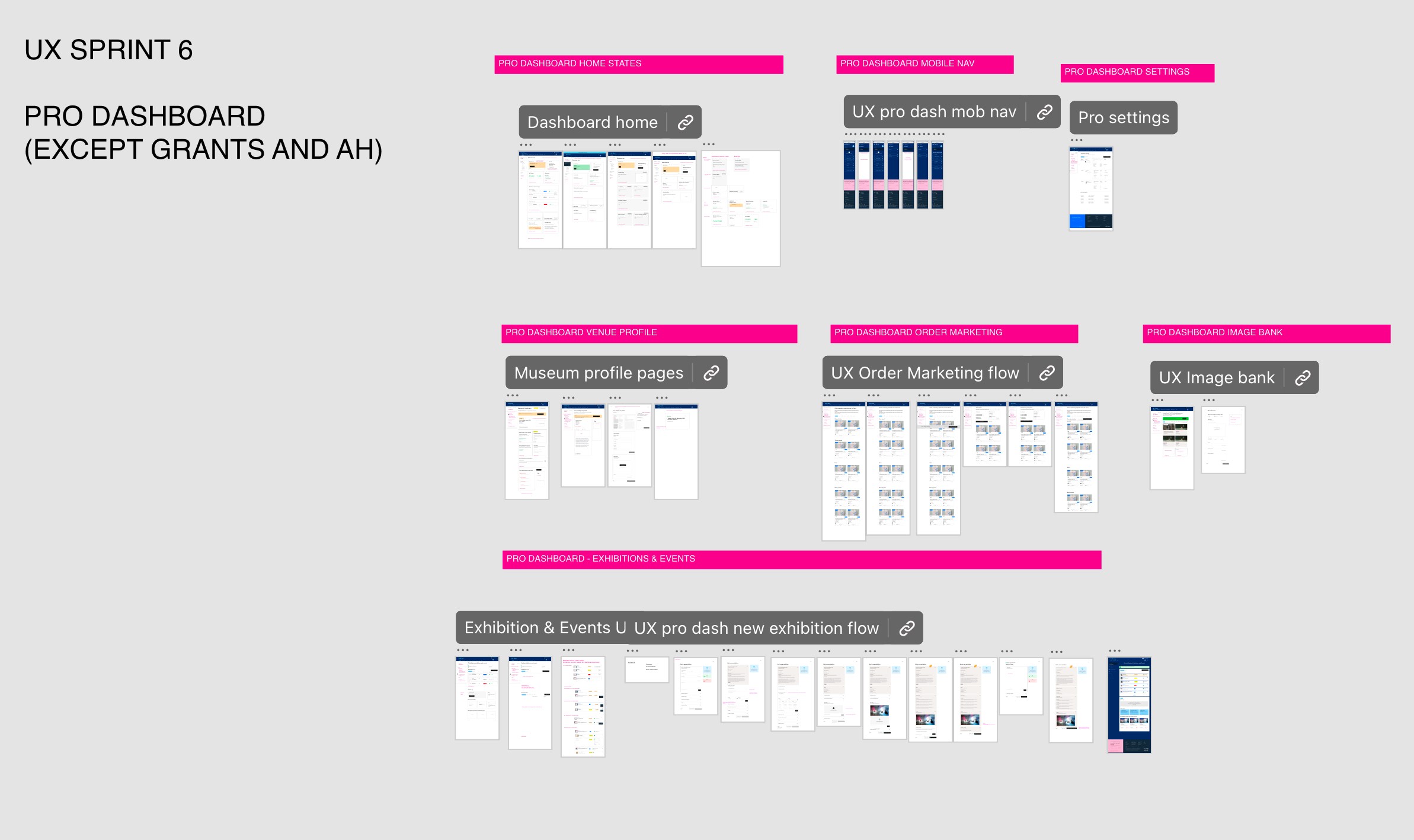
UX deliverables for the Sprint (XD)
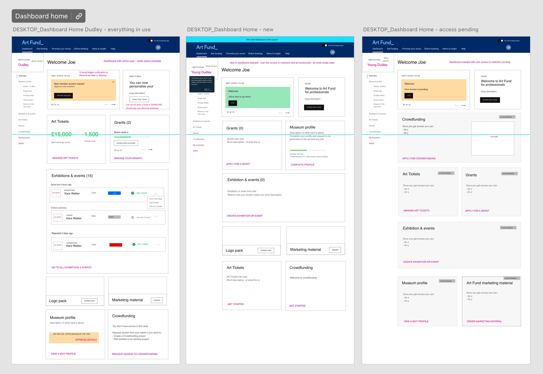
UX professionals dashboard wireframes
UX grant application form wireframe
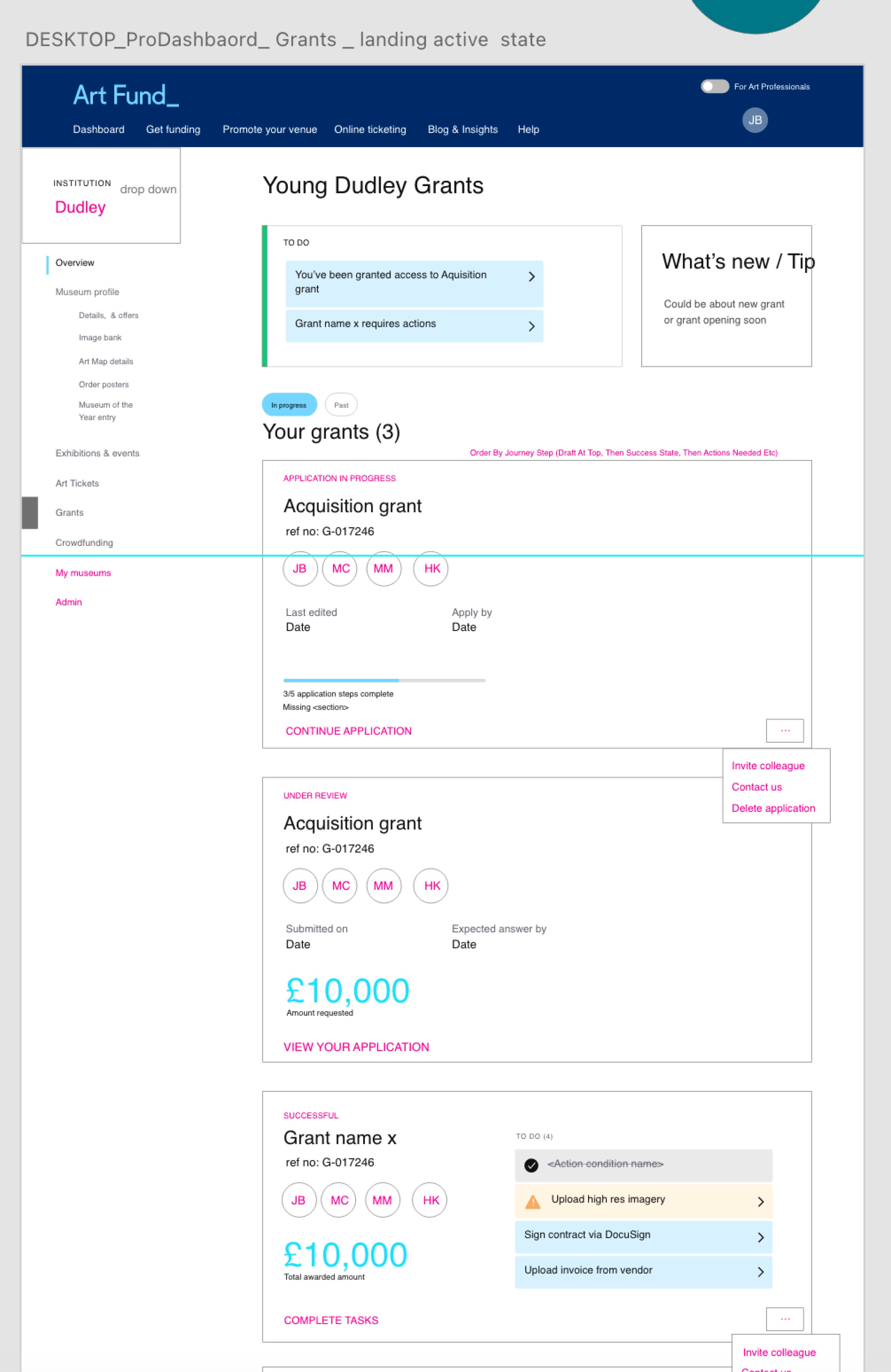
UX grants state dashboard
Redesigning the IA
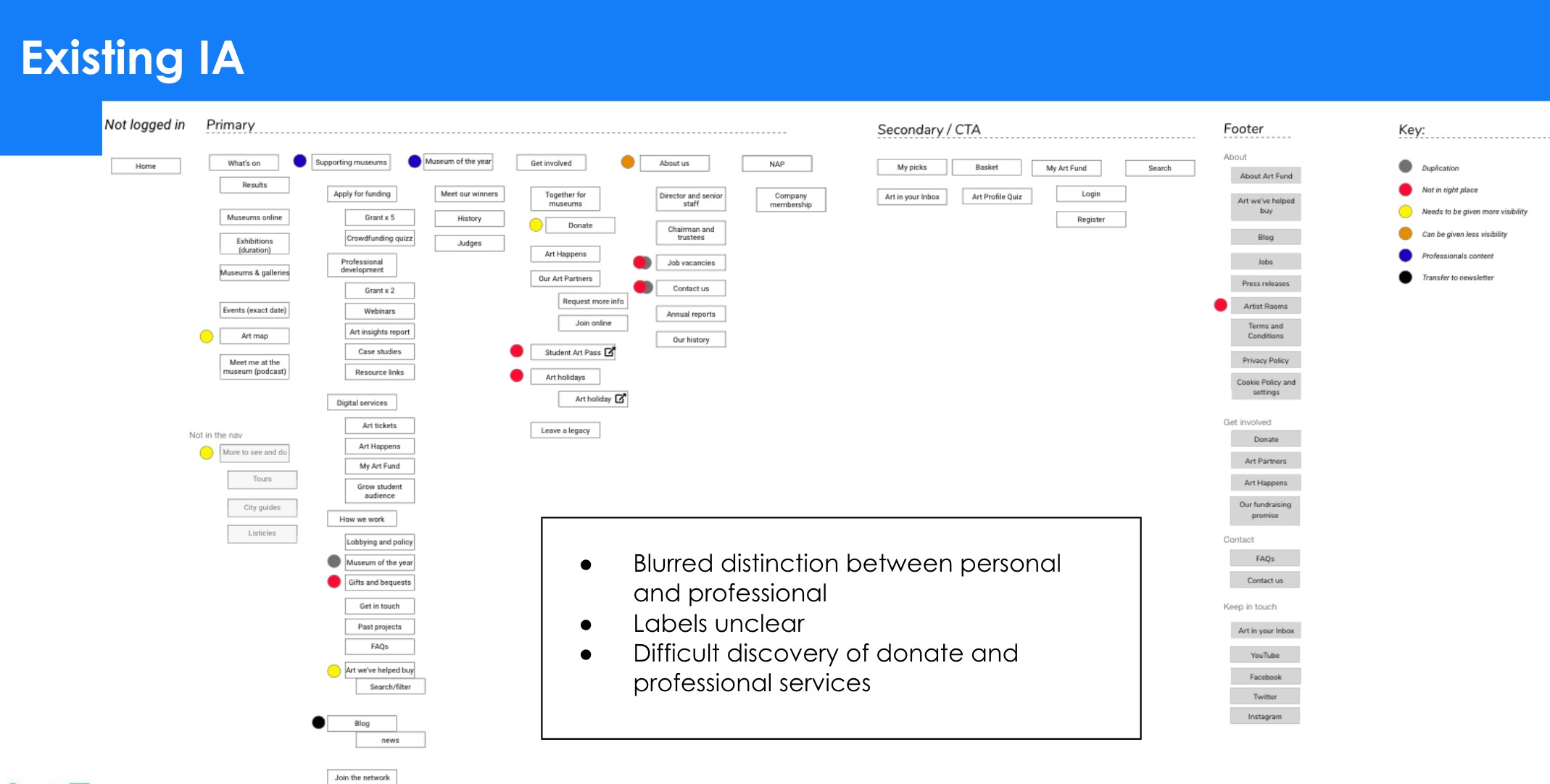
One of the biggest challenge of the project was redesigning the navigation system. The original site was hard to navigate, and we needed to untangle the public and professional experiences.
Some services were duplicated behind logins, some areas were ill-defined and unclear.
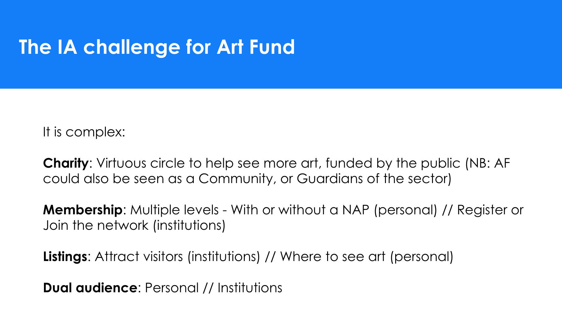
On top of this, Art Fund stakeholders were worried about how to tackle audiences that could potentially have both public and professional states.
Approach
As UX lead, my goal was to deliver a purposeful user-centred yet simple navigation.
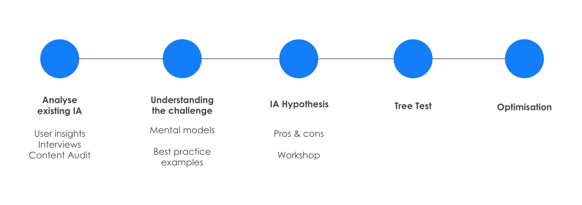
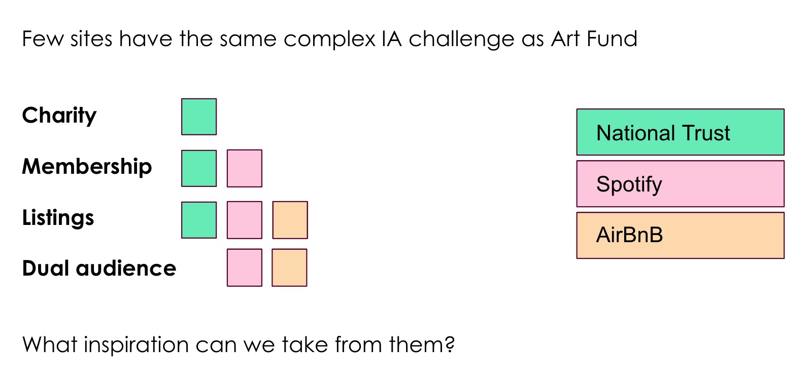
IA approach
Existing site map analysis
Analysis summary
Mental model analysis
Solution
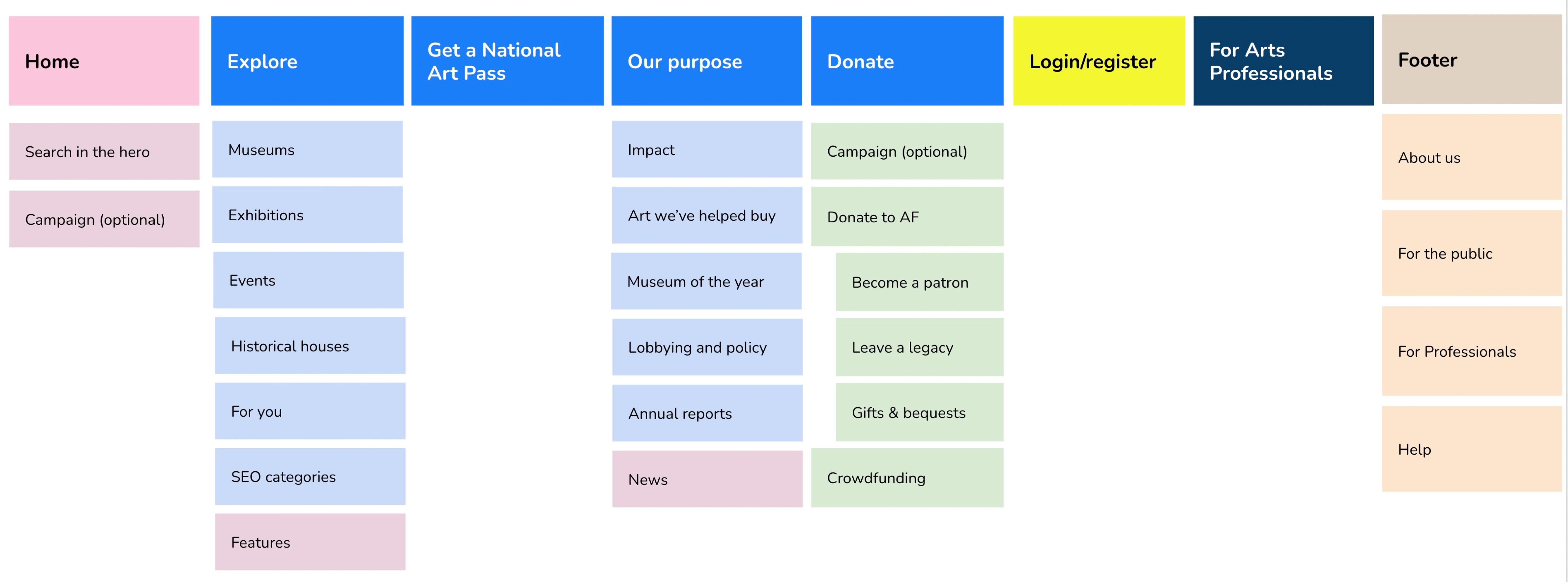
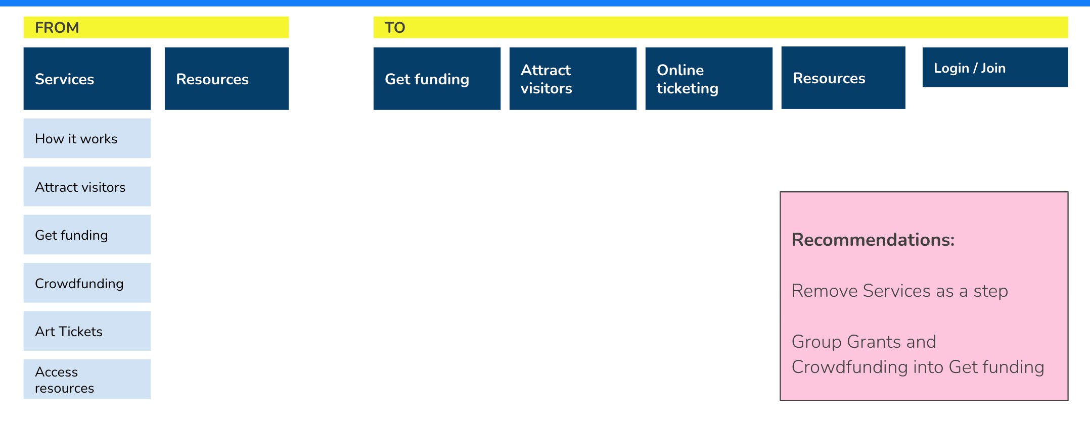
After analysis, a number of workshops, card sorts, tree tests and refinements, here is the new IA I receommended
General Public IA
Museum Professionals IA (From > To)
Result
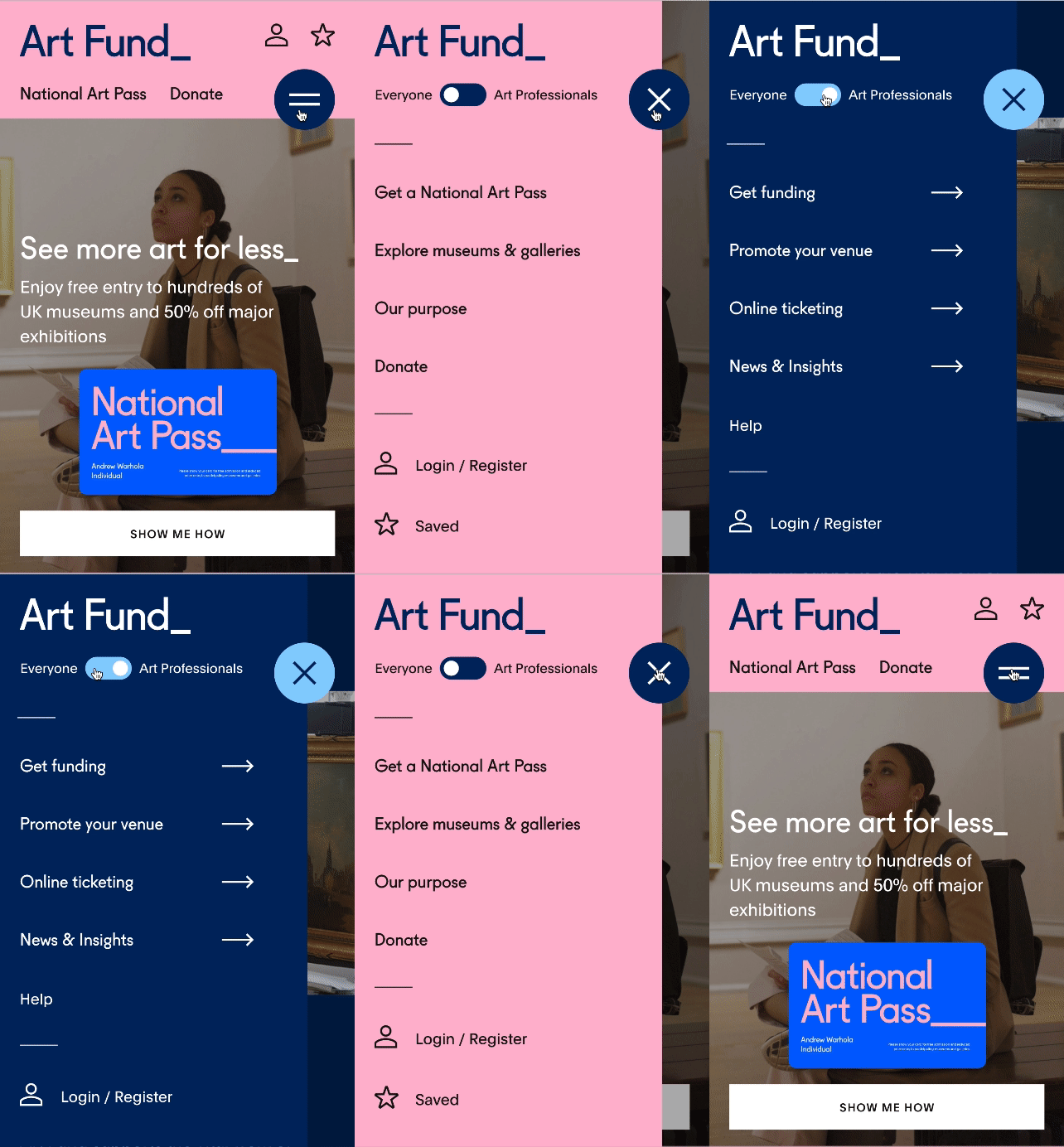
The result is a lot clearer and helps users discover all the services available to them from Art Fund in a personalised visual way. I managed to achieve this with a simple 2 level deep navigation.
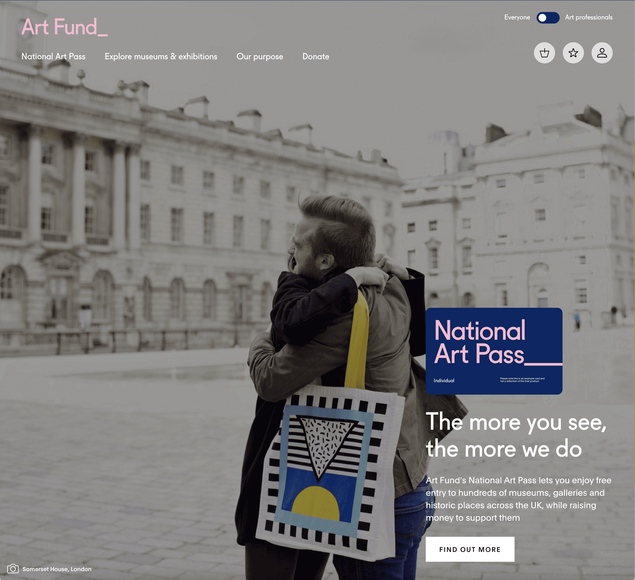
The toggle between public and professional view is playful and solves the problem of our dual audience.
I redesigned the registration process so that one could merge their consumer and professionals profiles if need be.
The new IA is live today and working a lot better than before.
Testing approach
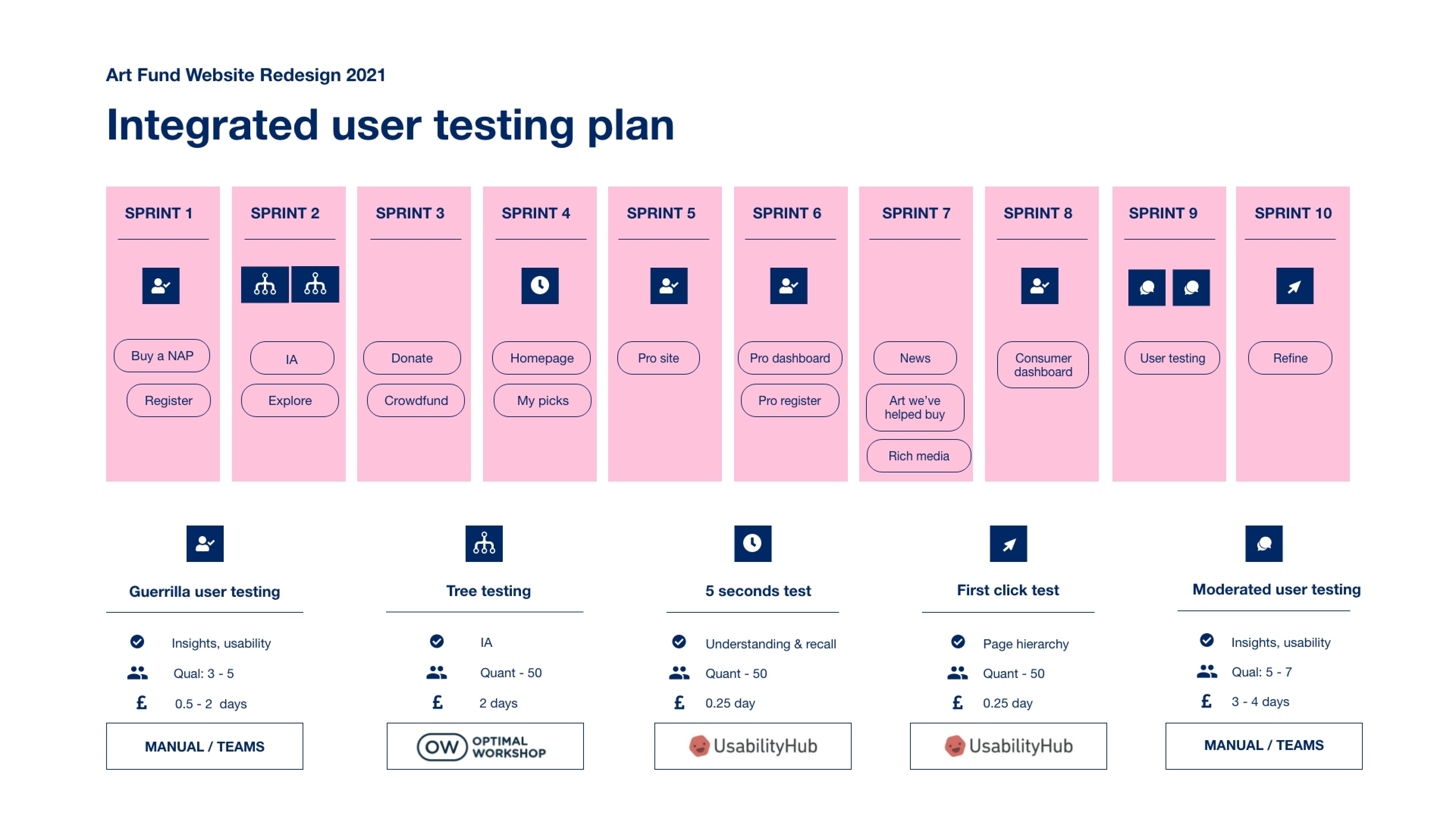
On this project, I used a flexible, integrated testing approach, making use of different methodology as and when needed.
Fit-for-purpose testing methodologies
I used a variety of testing methods at different stages of the project to get the best results fast.
Integrated testing plan
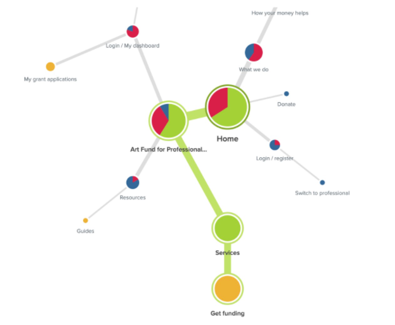
Tree test - navigation
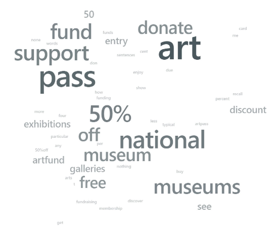
5s test - comprehension and recall
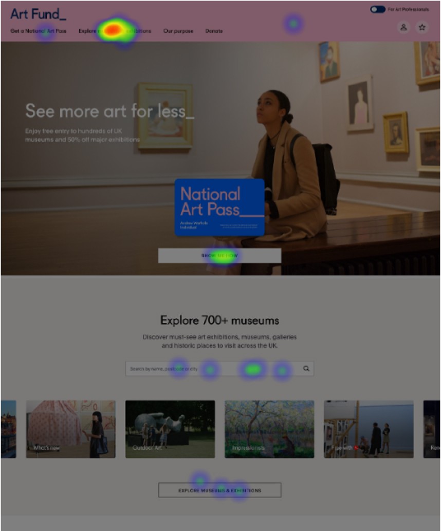
First click test - optimise layout
Overall result
This was a very challenging, fast-paced, pressured yet fun project. As a team, myself and the designer, Emily Regan, worked incredibly hard and closely with the client, our PO, Lauren Bailey, making the most of the agile methodology, but in a way that was adapted. We achieved extremely high velocity without compromising on quality.
I am hugely proud of what we have achieved as a team. The site looks beautiful and the client very happy with the impact it has had on all KPIs, in particular National Art pass sales and donations.
The project was so big that it has been delivered in phases. The first 3 are live. The 4th is imminent (as of Jan 2024).
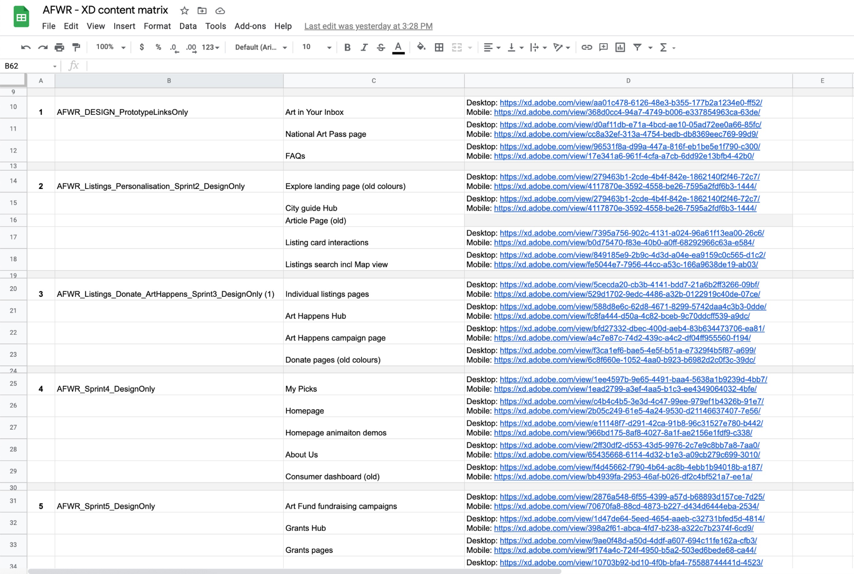
Specification documented in XD
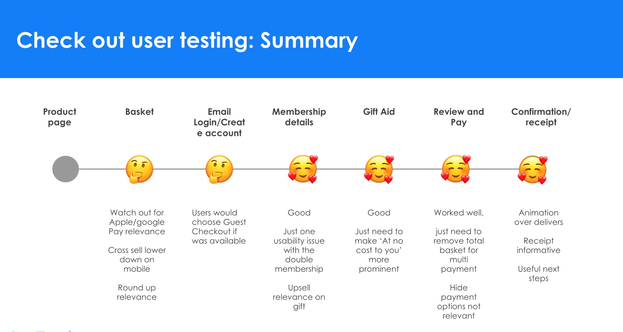
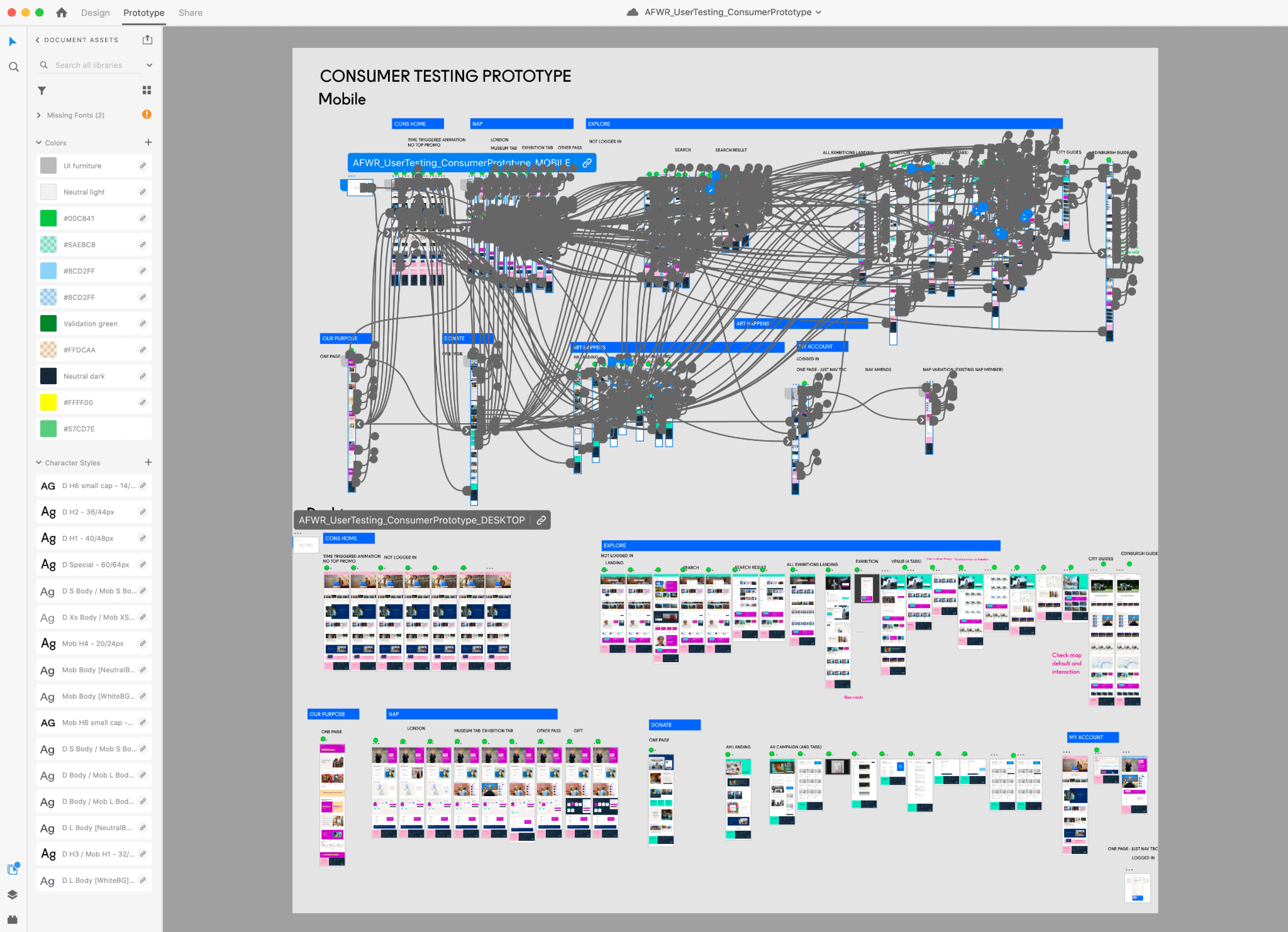
User testing design prototype
Agile readiness framework I created to onboard our clients
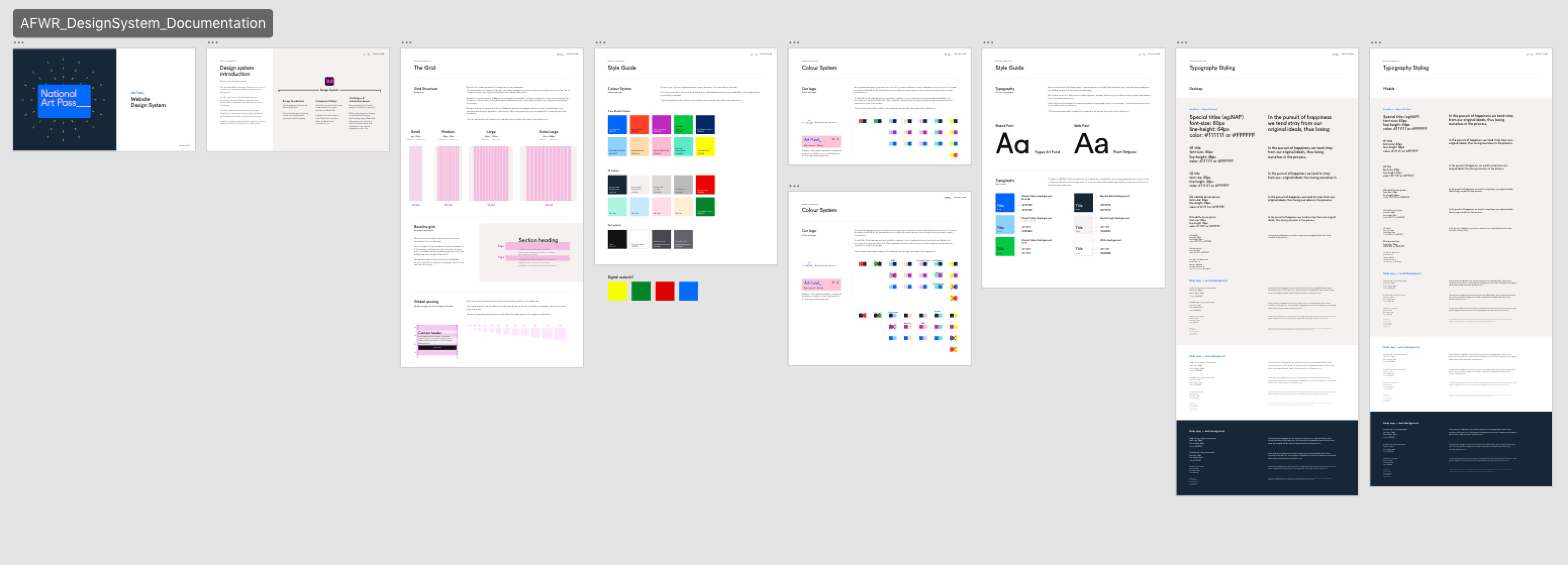
Design system - library extract, courtesy Emily Regan
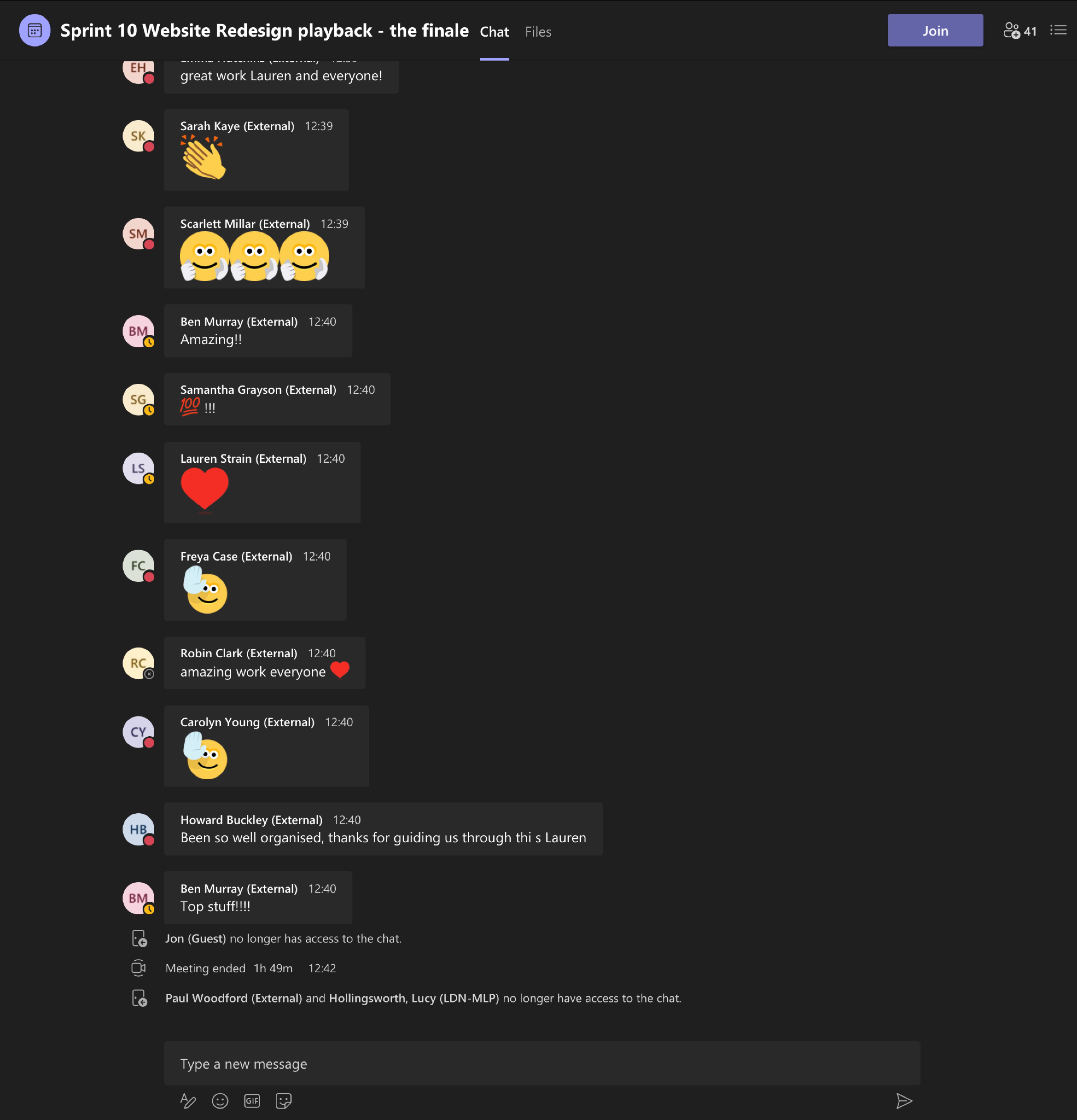
Typically our demos was to 40+ stakeholders and done on Teams

